Copying Elites: The British Illustrated Press, Indian Portraiture, and Alienated Labor
by Priti JoshiPriti Joshi is distinguished professor of English and Susan Resneck Pierce Professor of Humanities at the University of Puget Sound. She is the author of Empire News: The Anglo-Indian Press Writes India (SUNY Press, 2021), which won the Colby prize for best book from the Research Society for Victorian Periodicals and was shortlisted for the DeLong book prize by the Society for the History of Authorship, Reading, and Publishing. She has written on advertisements in Indian newspapers (in Victorian Periodicals Review); the India exhibit at the Crystal Palace (in Museum History Journal); scissors-and-paste journalism in Indian newspapers (in Amodern); the historical essay in Indian periodicals (in The Cambridge History of the British Essay); life writing in periodicals (in Life Writing and the Nineteenth-Century Literary Market); and exchanges between British and Indian newspapers (in Routledge Companion to Global Victorian Literature and Culture). Her publications on literary subjects include essays on Charles Dickens, the Brontë sisters, George Eliot, Frances Trollope, and Henry Mayhew.
Email the author: pjoshi[at]pugetsound.edu
Citation: Priti Joshi, “Copying Elites: The British Illustrated Press, Indian Portraiture, and Alienated Labor,” Nineteenth-Century Art Worldwide 24, no. 1 (Spring 2025), https://doi.org/10.29411/ncaw.2025.24.1.3.
This work is licensed under a Creative Commons Attribution-NonCommercial 4.0 International License  unless otherwise noted.
Your browser will either open the file, download it to a folder, or display a dialog with options.
Azim, the best painter, is almost a genius; except that he knows no perspective, so can only copy.
- Emily Eden, Up the Country (1866)
Emily Eden (1797–1869), the sister and travel companion of George Eden, 1st Earl of Auckland, the governor-general of India from 1836 to 1842, loved sketching. As first lady to the highest-ranking East India Company (EIC) official on the subcontinent, Eden’s job was to host and visit dignitaries, tasks she found wearisome. An amateur artist, she took refuge from these duties by drawing her way through India. Notwithstanding her frustration with her own skill,[1] Eden’s comment in my epigraph about the painter Azim echoes the persistent belief among Britons that because Indians lacked artistic perspective they were primarily copyists, incapable of “original” conceptions or of “drawing from nature.”[2] Eden’s comment about Azim dates to February 1839; three years later and a continent away, just as her brother’s governor-generalship was wrapping up, a new publication, the Illustrated London News (ILN), hit the newsstands in London. The ILN was not the first weekly newspaper to include images in its pages, but it was the first to yoke news with images.[3] Of its sixteen pages, eight included wood-engraved images interspersed with text, while the other half contained only text. The newspaper’s pledge to its readers that its illustrations would “picture the news” was an ambitious promise, given the accelerating speed of the news cycle in contrast to the available technologies for mass-producing images that had remained largely unchanged in terms of speed since the introduction of mechanical reproduction in Europe.[4]
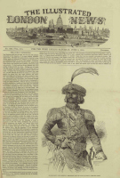
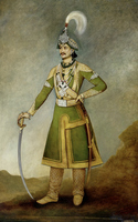
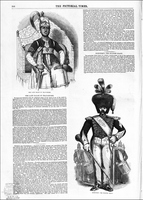
On the face of it, Eden and the ILN appear to have little in common. They are connected, however, by a thread that, for the moment, I shall refer to as simply copying. On June 8, 1850, the ILN ran a front-page image of Jung Bahadur, the prime minister of Nepal, who was visiting London (fig. 1). The accompanying text gushes: “His Excellency wears a rich Oriental costume, profusely wrought in gold, and glittering with diamonds, pearls and precious stones, stated to be worth £150,000 sterling.”[5] In the image, the young man is certainly bedecked with finery, but the reference to pearls is curious; even accounting for the limited capacity of wood engravings to convey tonality, pearls are not foremost in the image of Jung Bahadur. In speaking of his pearls, surely what the writer had in mind was a portrait in which pearls do feature prominently on Jung Bahadur’s breast (fig. 2). Painted by Bhajuman Chitrakar, (active 1820s–50s) the Nepalese court painter, the portrait was presented to the EIC by Jung Bahadur in 1850.[6] Chitrakar’s full-length portrait is the likely source of the ILN’s wood engraving—the newspaper’s image almost mirrors the painting, a reversal familiar to anyone working with prints. And yet Chitrakar’s name does not appear in the newspaper.
Fig. 1, Henry Anelay (draftsman) and Frederick James Smyth (engraver), His Excellency Jung Bahadoor, Ambassador from the Court of Nepual, 1850. Wood engraving. Published in Illustrated London News, June 8, 1850, 401. Artwork in the public domain; image courtesy of The Illustrated London News Historical Archive, 1842-2003.
Fig. 2, Bhajuman Chitrakar, Jung Bahadur, 1849. Oil on canvas. British Library, London. Artwork in the public domain; available from: Wikimedia Commons.
This article analyzes images of Indian elites in the British illustrated press between 1844 and 1857 and the portraits or styles of portraiture they drew from. Though elites were not the only Indians featured in the illustrated press, they appear in large numbers in the early years of illustrated newspapers. In the period under review, the other significant form for picturing India was landscape views, panoramic and picturesque scenes in which locals receded into the landscape or were entirely erased. Focusing on images of elites in the illustrated press, I bring two archives—portrait art from India and wood-engraved images in newspapers—into conversation and present two arguments: in recycling images from portraiture, newspapers were borrowing styles of visual referencing and replication that were standard practice in portraiture of late eighteenth- and nineteenth-century India; and practices of copying across media and between India and Britain led to the erasure of the large army of both Indians and Britons who did the work of replication or translation. We glimpse such erasure in Eden’s racially tinged dismissal of Azim and in the ILN’s silence on Chitrakar, and we will see it in the class hierarchy that operated in the wood-engraving shops in which image makers for Britain’s illustrated press worked.

Though the portraitist Chitrakar is not named in the image of Jung Bahadur in the ILN or in its caption or the text of the newspaper, two names do appear in the image: H. Anelay in the lower left corner and Smyth in the lower right (fig. 3). Henry Anelay was a landscape painter and illustrator who did jobs for the ILN.[7] As illustrator—or, the term used in the wood-engraving process, “draftsman”—his task was to translate a painting, sketch, or photograph into an image suited to carving on wood. Anelay was well-regarded at the ILN, as was the engraver who executed his lines on wood: Frederick James Smyth, who also freelanced for the ILN between 1843 and 1860.[8] Both Anelay, the draftsman, and Smyth, the engraver, had the cachet to claim signatory space on the images that appeared in the newspaper. Not every draftsman or engraver had such clout. The same issue of the newspaper in 1850 that included the image of Jung Bahadur on its front page carried on its last page an image of His Excellency Jung Bahadoor Riding Up a Granary at Patna;[9] this image has neither a draftsman’s nor an engraver’s signature and, as with the image of Jung Bahadur, no artist is mentioned.
Eden and the ILN both relied on notions of copying, even if their use of the term operated on different registers. One purpose of this article is to unpack these differences and highlight their kinship. When Eden spoke disparagingly of Azim’s ability to “only copy,” she was drawing on a set of ideas that had their origin in a European tradition ascendent since the Renaissance. Central to this tradition was the notion that a capable drawing or painting be a “copy of nature.” Perspective or foreshortening provided the illusion of depth on a two-dimensional surface; the resulting image was considered a faithful copy of nature, a rendering in two dimensions of what the human eye sees in three. To European eyes accustomed to such naturalism, graphic traditions that eschewed the techniques of perspective and depth appeared “primitive,” “naïve,” or just plain “wrong.” According to Eden, because Azim “knows no perspective,” he can “only copy.” And what he could copy, Eden continues, is her sketches:
[Azim] is quite mad about some of my sketches, and as all miniatures of well-known characters sell well, he has determined to get hold of my [sketch]book. There is a fore-shortened elephant with the Putteealah Rajah in the howdah, that particularly takes his fancy. However, I do not want them to be common, so I cut out of the book those that I wish to have copied, and I never saw a native so nearly in a passion as he was, because he was not allowed the whole book.[10]
In other words, Eden’s sketches served as intermediary, with Azim copying them rather than drawing directly from nature.
In her account, Eden assumes a hierarchy: she can copy from nature—that is, use foreshortening to translate onto the page what the eye sees—and thus create art, while Azim can only copy her copies. Rather than an originator, Azim, she reports, is one of “two Delhi miniature painters here, translating two of my sketches into ivory.”[11] Telegraphing a familiar “art-historical hierarchy through which the original’s value is secured as superior” and the copy devalued,[12] Eden casts Azim as only a copyist. It is the friction between the types of copying captured in this anecdote and the copying the Illustrated London News relied on to “picture the news” that connects Eden’s letters and London’s first illustrated newspaper. In what follows, I offer, first, a discussion of modes of replication and a brief history of exchanges between European and Indian graphic traditions; second, an account of technologies of replication and shop practices of illustrated newspapers; and third, an analysis of images of Indian elites from the midcentury British illustrated press. The attention to varieties of “copying” and to exchanges between graphic communities and across media serves to anchor my argument about labor hierarchy and the erasure of the many hands—Indian and British—who made the modern phenomenon of mass-produced illustrated newspapers possible.
Copies: Sanctioned and Devalued
To copy or replicate something involves imitating or re-presenting an antecedent. In both literary and graphic arts, forms of copying proliferate along a spectrum from plagiarism to citations, from references to allusions to wholesale reworkings of a predecessor. In art, compositions, motifs, forms, and styles are replicated or reworked with visual quotations, allusions, and citations as well as plagiarized hoaxes. Yet, crucial differences exist between the literary and visual realms, primary among which is that the singularity of an image is highly valued. Though a bibliophile may covet a first edition of George Eliot’s Middlemarch, no scholar need consult that edition to write a monograph on Eliot. No serious scholar of Vincent van Gogh, however, would write a study of his works without consulting them in person and closely. We take this difference for granted, but it behooves us to unpack its logic, which derives from the mid-fifteenth-century “print revolution” in Europe and the dual meanings of the word “print.”
In Europe, the technology of woodcuts—which allowed “prints” or copies of images to be replicated on a wider scale than previously—predated Johannes Gutenberg by some three or four decades. (In China, of course, woodcuts had been used for both images and letters since at least the seventh century.) With the advent of the printing press, text was multiplied on a scale and at a rate far exceeding what a team of scribes could replicate. But while moveable type and woodcuts (later copper engravings, and even later, stone lithographs) extended the reach of an original, their impact bifurcated: multiple copies of textual material fueled and accelerated the growth of knowledge and literacy; by contrast, the ability to replicate images elevated the singular original and devalued its prints. This depreciation took place gradually in the wake of the explosion of relief and intaglio printing in Europe. The art historian Caroline Karpinski locates this shift in the seventeenth century, after which what was once “parity among the three forms of graphic art—drawings, original prints, and prints of reproduction” came to an end.[13] Thereafter, a “print of reproduction” mattered “not for itself but solely to know the original,” a tool to provide “multiple impressions in immortalizing perishable paintings.”[14] By the eighteenth century, “perishable paintings” had acquired primacy and the devaluation of prints was entrenched.[15]
Relief or intaglio prints of paintings—“prints of reproduction,” as Karpinski refers to them—are forms of copying across media, otherwise known as transmedial. (More common forms of medial transfers are from text to screen or text to image.) Because each medium operates within its own logic and grammar, every transmedial object, no matter how close or distant a copy, is an interpretation of its source. The degree of difference and interpretation between a transmedial “copy” and its antecedent may vary, but copying across media is never seamless. (Neither, of course, is copying within media; post-structuralists and bibliographers have long maintained that every copy is always already a new object.)[16] In Europe, as the means to multiply copies accelerated with moveable type and technologies for the replication of graphic images, so too did the surveillance and policing of all forms of copying. Thus, copyright, the ownership of a string of words, ideas, notes, or images, was born. Prior to the mechanical reproduction of text and images, cultural products such as oral narratives, fairy tales, and recipes were detached from an author or originator and floated freely. With woodcuts and moveable type, the distance between author and output shrank and intellectual property rights were born.[17]
These notions of authorship traveled beyond Europe. On the South Asian subcontinent, as the art historian Vishakha Desai writes, “With the development of Mughal painting in the sixteenth century, names of individual artists became known for the first time in India in significant numbers, and the idea of a ‘unique’ work of art by an individual took moderate hold within the Indian tradition.”[18] This development came about as a result of encounters with Europeans. Between 1580 and 1599, Jesuit missions visited the court of Akbar I (1542–1605) and presented the emperor with numerous items including Christopher Plantin’s seven-volume Polyglot Bible with illustrations, as well as engravings after leading Dutch and German masters such as Albrecht Dürer (1471–1528).[19] Court artists studied the images and traced them, and by the end of the sixteenth century, Susan Stronge writes, “European conventions began to permeate Mughal painting: fabrics appeared to billow, the human form seemed to have three-dimensional weight, and compositions suggested depth and recession, though they never conformed to Renaissance scientific principles of perspective. Crucially, the way in which faces were depicted began to change.”[20] Prior to the encounter with European styles and forms, persons in a portrait were identified by their location in the composition or by emblems such as jewels, turbans, or weapons;[21] following the encounter, individuals appeared as unique, identifiable figures, no longer as “types.”[22] Mughal art, which had hitherto drawn from Persian traditions of the miniature, now gradually adopted European visual elements, such that “from the middle of the eighteenth century, most styles of Indian portraiture were increasingly affected by European influence. This is discernable through changes in Indian artists’ approaches to composition, modelling, perspective and technique” and artists’ abandonment of “strict profile and silhouetted bodies in favour of more naturalistic renditions.”[23]
Artists, whether Hindu or Muslim, in Mughal, Maratha, Awadhi, or Rajput courts, not only adopted, but also selected and rejected elements they encountered. One example of such rejection is identified by Stronge, who notes that “several conventions would persist in formal [Mughal] court portraiture for decades. Individuals were typically shown with their faces in profile, feet pointing to the side and shoulders turned towards the viewer, against a plain, light green ground. . . . [T]he precise tilt of the shoulders and upper body . . . changed surprisingly infrequently. This provides a rare instance of the continuation of a long-established Indian tradition into seventeenth-century court painting.”[24] Bengali and Awadhi artists, J. P. Losty notes, were uncomfortable with “standing portrait subjects, isolated like natural history specimens against a plain background;” instead, they placed their subjects “seated, before an architectural or fully developed landscape background.”[25] But in the late eighteenth century, Awadhi artists also selected and selectively incorporated European techniques, combining in the same painting lighter washes borrowed from the English watercolor tradition for the landscape with Mughal-style, opaque mineral pigments for figures.[26] It is such selection and selective adoption that leads the art historian Natasha Eaton to argue that in early nineteenth-century India, copying was not imitating; rather “to be a copyist is potentially to be a mimic who is able to subvert and to dismantle Western mimesis.”[27]
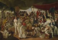
This account of subcontinental artists adopting and adapting elements from European art traditions has been well documented.[28] Only recently have scholars studied the ways Europeans, too, adopted aspects of subcontinental styles into their works. Such incorporation occurred largely by artists who received commissions from Indian patrons in the independent Maratha and Mughal courts that dotted India in the late eighteenth century. One example is the painter Johan Zoffany (1733–1810), a founding member of the Royal Academy. Zoffany traveled to India in 1783–89 and painted both EIC officials such as Warren Hastings and the Nawab of Awadh, Asaf ud-Daula. The art historian Maya Jasanoff writes that during his time there, “Lucknow [the capital of Awadh] influenced Zoffany in turn, as he took on Indian subjects and compositional styles.”[29] His most famous oil painting from this period, Colonel Mordaunt’s Cock Match (fig. 4), she writes, demonstrates Indian styles “in its microscopic detailing, its flattened perspective and its narrative density . . . reminiscent of classic Mughal miniatures.”[30]
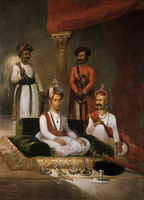
Holly Shaffer offers a granular account of the British artist James Wales (1746–95) and the work he produced in Pune when Nana Fadnavis, a high-ranking official in the Maratha court, commissioned Wales to paint a number of portraits in the 1790s. Highlighting the tutelage involved in this commission, Shaffer cites one of Nana Fadnavis’s assistants who counsels that “we should show [Wales] good and bad Indian pictures so that he knows what types of pictures are good. For him this study of pictures is new, therefore we should instruct.”[31] Wales’s group portrait of 1792–95, Madhav Rao Narayan, the Maratha Peshwa, with Nana Fadnavis and Attendants (fig. 5), is one of the best-regarded examples of work by a European artist for an Indian patron. In the last section of this article I shall return to this portrait and its recurrence in a newspaper; for the moment, I want to highlight Shaffer’s subtle argument that the image was the product of negotiation between Wales and his sitters, who dictated precisely how they wished to be represented, including the clothing and accoutrements in which they appeared.[32] Moreover, Shaffer writes, Madhav Rao, the young peshwa, did not hesitate to borrow elements from multiple traditions. The elaborate jeweled ornament on his turban, a sarpech, was borrowed from Mughal styles, while the saucer-shaped turban worn by him and Nana Fadnavis, his older advisor, was the distinctively Maratha pagri. Wales’s Indian patrons directed him to produce a portrait that combined multiple visual modes to convey power and authority; the result, Shaffer argues, was a painting by a Briton that combined Mughal, Maratha, and English visual styles and compositions. So pronounced was this recombinational impulse on the subcontinent that Eaton refers to the late eighteenth and early nineteenth centuries as a period of “dynamic convergence, opposition, and persistence of Indian and British pictorial choices.”[33]
From Portraiture to Print
In its complex borrowing and reworking of multiple visual traditions, Wales’s painting appears to be the polar opposite of the Illustrated London News’s image of Jung Bahadur (see fig. 1), which freely replicated a single—unattributed—portrait by Chitrakar (see fig. 2). Yet, as I will demonstrate, the compositional and stylistic continuities between portraits from India and prints of Indian elites in Britain’s illustrated press mirror the varieties of copying and borrowing that operated in the visual arts generally and between British and Indian portraiture specifically, with a few historically specific differences. The first of these differences is the medial shift that occurred when a portrait made the journey from pigments or washes to wood engraving. This journey incurred a shift in materiality, certainly, but also of scale. Wood engravings that replicated an original on an increasingly industrial scale required new labor arrangements, systems that developed and flourished in nineteenth-century newspaper-print shops. A final relevant historical factor is nineteenth-century newspapers’ practice of promiscuous borrowing from a variety of sources to fill their columns. The scholarly literature on “scissors-and-paste journalism” is extensive, and in the last several years scholars have repudiated the canard that reprinting was practiced by only the provincial press.[34] Digitized archives have aided the task of disclosing the extent of reprints, but such work remains largely limited to the textual. A small number of scholars have begun to address graphic cut-and-paste. Through detailed archival work, Thomas Smits shows that the British, French, and German illustrated presses of the mid-nineteenth century reprinted images from one another, collegially trading stereotypes, the metal plates of a wood engraving or typeset page. Such material exchanges led to a “transnational visual culture of the news,” Smits writes, well before the advent of photography and halftone in the 1880s accelerated the pace and ease of image exchanges.[35] This article builds on the work of tracing visual replications Smits and others have begun, adding a transmedial angle and a colonial frame. Transmediality and coloniality push us to expand notions of reprinting beyond metal stereotypes or facsimiles—a true cut-and-paste—to a broader variety of copying styles, including borrowed compositions and motifs.
In the mid-nineteenth century, the process whereby a painting, drawing, or sketch was translated into an image that appeared in a newspaper required several medial shifts and a considerable flattening of the image in the process. Relief is an on-off process—carved spaces appear blank while the uncarved catch ink and form the image—and tonality is difficult to achieve. In addition, wood-engraved images in newspapers like the ILN passed through many hands. The process began with an individual whom I shall refer to as the artist who drew or painted an image. The image might be “copied from nature” or it could be a sketch of an existing image. On the engraving-shop floor, a draftsman—sometimes confusingly referred to as an artist—translated the artist’s work into a sketch that he (it was generally a he) transferred or outlined on wood. The woodblock was then handed off to engravers who took gravers and burins in hand and got to work carving the blocks. (Though not directly related to the image-making process, the printer who placed the carved block with captions or accompanying letterpress in a frame preparatory to inking and printing the page was the last hand through which an image passed.)
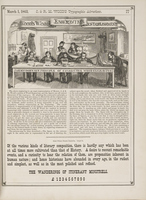
Whereas Paul Fyfe describes this process as one of “collaborative artistic and technical craftsmanship from drafting to engraving and finally to manipulation while on the press,”[36] I highlight its hierarchal and fragmented nature. A wood engraving from 1863 in the trade publication Typographic Advertiser graphically captures the assembly-line nature and labor hierarchy of the engraving shop (fig. 6). At the head of the worktable is the draftsman tasked with translating a sketch or painting into a drawing that functioned within the limitations of relief engraving. To the draftsman’s right are four engravers, each with a block balanced on a cushion, a jewelers’ loupe in one eye, and an array of tools beside him. Each engraver worked on the part of an image that matched his skill set: outlines, parallel shading, backgrounds, and so on. The foreman, standing at the center in the engraving, generally engraved critical features, such as faces that required the highest level of skill. A text block within the engraving touts the establishment’s “principle of consecutive wood engraving.”[37] Yet, though each engraver added to the image, in the engraving they are effaced: the engraver’s signature in the lower right reads “Wood & Co.,” naming the firm rather than the craftsmen.[38] The benign scene camouflages what the print historian Michael Twyman identifies as the transition of wood engraving from a “craft to an industrial trade” in the space of a few decades, a change catalyzed largely by the needs of the illustrated news media.[39]
As an image passed through these many hands in the chain of production, each stage introduced the possibility for alterations, embellishments, or errors. The print historian William Ivins notes that draftsmen on the shop floor were often interventionist: “The artists in the field or at the front would send back little sketches of the most generalized and undetailed variety. These were then copied in large size on the big blocks for the centre pages by draughtsmen attached to the home offices, who supplied the detail and the tonality missing in the little sketches.”[40] In his memoir Henry Vizetelly, the inaugural art editor of the ILN, corroborates this description. In 1842, during the ILN’s early days, word arrived of a fire in Hamburg. Vizetelly reports that he had one of his artists visit the British Museum, select an image of the city, copy it, draw it on wood, and then add “the necessary flames and volumes of smoke, as well as the crowd of people, in boats and on the river bank, supposed to have been attracted by the conflagration.”[41] Vizetelly was satisfied, as were the ILN’s readers.[42] From the perspective of verisimilitude, however, the end product of such practices was, in Ivins’s words, a “second- or third- or fourth-hand account, or even [a] badly jumbled account by many different people, of what things were supposed to look like.”[43] For Ivins, such images were “not only copies of copies but translations of translations,”[44] and he is severe about the corruptions introduced.
Julie Codell and Linda Hughes, by contrast, are more sanguine about interpretations introduced at each stage of remediation: “Replications re-made prior versions,” they write, producing “a ‘creative copy’ that reflected both the transmission and the creation of ideas that could be expressive and reinventive.”[45] Like Codell and Hughes, I see promise in a chain of copies. I have written elsewhere about the indigenous Indian press that drew at once upon the British satiric periodical Punch, Kalighat paintings, and street prints from the Battala neighborhood of Calcutta; the result was a hybrid of visual styles and figures deployed for political ends or to form alliances across racial and religious lines.[46] This article, with its focus on representations of Indian elites in Britain and on labor conditions in the creation of mass-produced images, foregrounds the formulaic and stereotypical aspect of translations or additions that artists, draftsmen, or engravers introduced into their images of geographically and culturally distant colonial subjects.
If Vizetelly’s Hamburg-fire anecdote telescopes a culture of embellishments and a flexible attitude toward verisimilitude, it conveys as well the looming presence of the clock. In the news business, where speed is of the essence, illustrated newspapers relied on existing images—which they sometimes doctored—or “stock blocks,” as they are known in the trade. (Stock blocks are, of course, a precursor to the stereotype, the metal cast of a page that allowed for more and quicker copies. Both are the trough that fed the sense of stereotypes as oversimplified labels slapped onto a person or group.) While the clock was always outpacing the newspaper print shop’s output, additional factors specific to the organization of the engraving-shop floor are relevant for this analysis. The room for expressiveness Codell and Hughes celebrate was seldom available to engravers, who were working fast, twice removed from a sketch, and expected to replicate the details of brush and color in a medium that not many outside their profession understood. In 1844, wood engravers complained to the ILN management “that an artist [i.e. draftsman] who has but little knowledge of the practice of wood-engraving, and no idea whatever of adapting his drawing to the purposes of printing, will frequently produce a design, which, though it may appear very pretty on the block, may . . . prove, after all, but an indifferent wood-cut, which it may be very difficult to print well. . . . For the want of such knowledge in the designer, it frequently happens that wood-cuts, though carefully and elaborately engraved, yet appear very insipid when printed; and thus the engraver . . . is blamed for deficiencies which are entirely owing to the designer.”[47]
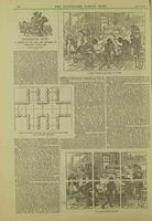
Compounding this mismatch between draftsmens’ ignorance and the burden it placed on engravers was a shop practice straight from the industrial playbook. I mentioned earlier that engravers each specialized in a single skill—faces or foliage or garments. Increasingly, they worked on their portions of a block in isolation, as, particularly for larger images, small wooden blocks were bolted together to form the full picture. An article in the ILN from 1879, “A Sketch of the Rise and Progress of Pictorial Journalism,” proudly illustrates this technique in three images that appear on a single page (fig. 7). At the center left of the page is a view of the reverse side of the carving blocks bolted together; at the lower right is a view of the six blocks laid beside one another; and at the top right is a view of the sutured image. This page very literally pictures the fragmented and alienated labor that is the hallmark of the industrial process of copying and replication in the illustrated press. It also makes clear that even when an image was signed by one engraver, that name was subsuming the labor of many who remain unnamed. (That the ILN chose to illustrate its practice of labor fragmentation with an image of Black laborers overseen by a white woman and surveilled by a uniformed white man is a breathtaking instance of the return of the repressed. Nothing better illustrates the alienation of both image producers and nonwhite subjects and the ways the two were kept apart.)
The Race and Class Politics of Signatory Prestige
Traces of “translations” and of the hierarchy of the engraving shop are visible in the images illustrated in this article if we know where and how to look. As figures 1 and 3 show, the protocols of attribution were a politics of prestige. The British Anelay and Smyth, draftsman and engraver, respectively, of the ILN’s image of Jung Bahadur, garnered signatory real estate on the image; Chitrakar, the Nepalese artist whose portrait they were copying, did not. Generally, when an image was after a famous artist—Michelangelo (1475–1564) or James McNeill Whistler (1834–1903), for example—the artist was named in the caption or the text of the article in which the image appeared. Similarly, draftsmen with reputations—William James Linton (1812–98) or John Tenniel (1820–1914), who illustrated Alice in Wonderland, were a brand, and their signatures appeared prominently. Engravers were lowest in this pecking order: they were considered mere assistants in a workshop, were sometimes disparagingly referred to as “rats,” and remain largely unnamed.[48] Add to this labor elitism a colonial order and the imbrications of class and race become explicit. In the early days of the illustrated press, most Britons—whether consumers of the illustrated press or the draftsmen and engravers who produced the images—knew little beyond stereotypes about Britain’s imperial holdings. Image makers, racing against the clock, drew upon these metaphoric stereotypes as they worked. In the process, Indian artists were taken up, used, and made invisible, and their work revised to fit imperial conceptions. In this section, I examine a sample of images of Indian elites made between 1844 and 1857 to illuminate the politics of signatory prestige and the resulting erasure.
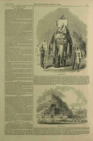
In 1844, the ILN printed a standard-issue image of “the Orient”: a looming elephant with small figures perched upon it and several fierce-looking retainers milling about (fig. 8). The image, we are informed, is of the “Raja of Putteealla,” the very raja Emily Eden had sketched in 1839. Azim had fancied that sketch, but she had withheld it from him—and now we learn why: on Eden’s return to Britain, a collection of her sketches appeared in a lithographed album. The ILN’s image of the Raja of Patiala on an elephant was after Eden’s sketch.[49] The text of the essay below the image states that “Miss Eden’s accomplished pencil has sketched with rare fidelity and beauty” this “specimen . . . of pomp and semi-barbaric splendour.”[50] (The paper’s identification of Eden as the daughter of Lord Auckland—she was his sister—gives one pause about its fidelity to facts.) Tellingly, Eden, the aristocrat-artist, is named, but a draftsman is not, though an engraver is: at the lower right is Smyth’s signature, which we have seen before on the image of Jung Bahadur from 1850 (see figs. 1, 3). Two years later, the Raja of Patiala was featured in the ILN again (fig. 9). This image of the raja on a horse from 1846 is subtitled From a Sikh Drawing, and the text accompanying it states that the portrait is “copied from a native drawing, curiously executed in colours, and illuminated with gold.”[51] The “native” is not named, and neither a draftsman’s nor an engraver’s signature appears on the image; it was likely executed by an “unknown,” low in the pecking order.
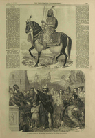
Examining these two versions of Karam Singh of Patiala is instructive: Eden’s is almost farcically stereotypical, while the image from 1846 is a textbook case of hybridity in Indian portraiture. The latter follows the Sikh tradition of portraying a leader on a horse with a halo around his head.[52] Stronge writes that “the halo [was] a form borrowed [in the seventeenth century] from the Christian paintings. . . . It would become a cliché in the representation of kings in all regions under Mughal artistic influence, whether Hindu Rajasthan or the Sikh courts of the Punjab.”[53] In addition to the halo, the three-quarter view of the raja we see here was also an adopted form, though more recently taken up. Losty writes that it was only in 1810 that an Indian artist, Ghulam Murtaza Khan, for “the first time [abandoned] the hieratic full profile” in favor of a three-quarter view of his subject.[54] Though incorporated two hundred years apart, both the halo and three-quarter view are signs of the adoption and adaptation of European forms by Indian artists.
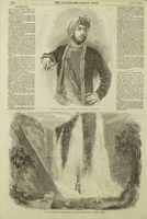
That three-quarter view is replaced by a full-frontal view in The Late Rajah of Travancore from 1847 (fig. 10). The combination of the frontal view and the image’s flat plane makes this a curious image. The proportions and nonreceding lines on the throne suggest an artist working outside the dictates of linear perspective. At the same time, this is one of the few images in my sample in which the subject faces the viewer frontally. On the subcontinent, the “hieratic full profile,” as Losty refers to it, was a feature of Mughal portraiture and was dominant for some two centuries. Three-quarter and frontal views were introduced from European traditions;[55] gradually and unevenly, between the late eighteenth and early nineteenth centuries, Indian “artists abandoned strict profile and silhouetted bodies in favour of more naturalistic renditions.”[56] Yet, the frontal gaze also evoked an indigenous practice that Renate Dohmen describes thus: the “frontal view is reminiscent of Hindu religious iconography that entails a religious form of seeing called darshan, which involves the act of standing in the presence of the deity and seeing the image with one’s own eyes.”[57] The Raja of Travancore was Hindu, and though the artist or circumstances under which this image came about are not named,[58] its two-dimensionality along with the intensity of the unusual frontal gaze signal the presence of a thoroughly hybrid style of portraiture in London’s illustrated press. The wood engraving appeared in the Pictorial Times, the short-lived, rival paper Vizetelly started after he left the ILN. While an artist is not named, the signature at the left just under the throne’s wood molding, an “S” superimposed with a “T,” belongs to Thomas Scott, a draftsman and portrait engraver who was just starting his career.[59] Embedded in the border of the throne on the right are the initials “SN” that I have been unable to identify. For two unknowns to garner signatory real estate is unusual and may signal Vizetelly’s attempt to woo young image makers to his new paper with the promise of publicity.
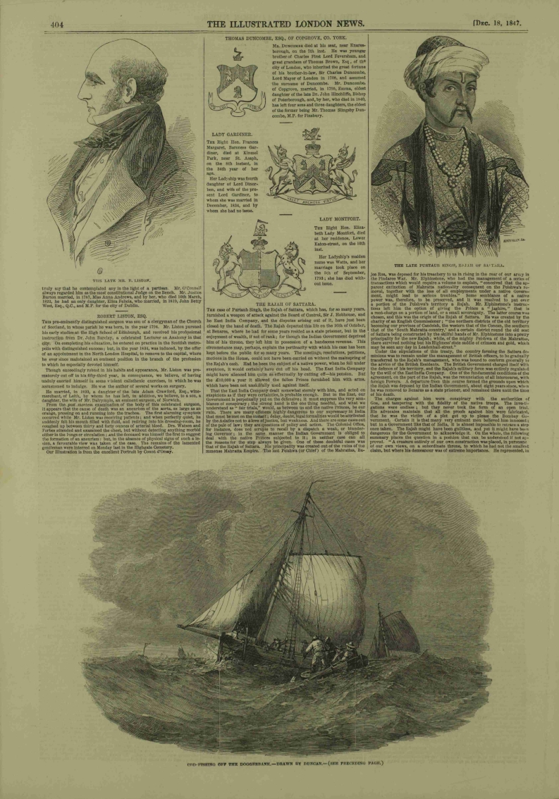
That Vizetelly was unable to secure the fortunes of the Pictorial Times is evident in an image of Raja Pratab Singh from 1847 (fig. 11). As the signature at the lower right indicates, the engraver here was none other than Vizetelly who, given his fledgling paper, had picked up piece work for the ILN. He was able to secure signatory space, even as an engraver, the lowest position in the hierarchy of the engraving shop, because of his former role as art editor of the ILN. Predictably, the image does not name an artist or draftsman. By contrast, the image of Duleep Singh that appeared in the ILN some eight years later (fig. 12) not only includes an engraver’s signature (Smyth, as in the image of Jung Bahadur in figure 1) but also names in its captioned title the source of the image: a Collodian by O. G. Rejlander. Duleep Singh was heir to the Sikh throne and was deposed when the EIC annexed the Punjab at the conclusion of the Second Anglo-Sikh war of 1848–49. The young man was transported under escort to Britain, where he “gifted” the Koh-i-noor diamond to Queen Victoria. As a “friendly” Indian elite, he was much feted: Victoria sketched him, her resident artist Franz Xaver Winterhalter (1805–73) painted him, and the renowned photographer Oscar Gustave Rejlander (1813–75) photographed him.[60] The composition of the ILN image is distinctly European: aside from his turban and jewels, the empty-handed Duleep Singh is standing (rather than seated) and appears against a plain background, elements Losty notes Indian court artists avoided.[61] This image of an anglicized Indian elite, after a photograph by a prominent photographer and engraved by a veteran engraver—all named—proclaims and performs the hierarchies the British illustrated press operated within and replicated.
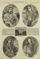
If the image in figure 12 has European fingerprints all over it, the one in figure 13 conveys a distinctly “Indian” look. Paired images of the deposed “king” (nawab) of Awadh (anglicized as Oude) and his wife appear under the headline “Sketches in India from Native Drawings.” The oval miniatures of Wajid Ali Shah and his wife Begum Hazrat Mahal appeared on November 28, 1857, during the stormiest days of the Uprising of 1857 that challenged British rule on the subcontinent, when Britons’ clamor for information about India prompted the ILN to add a twenty-page supplement to its standard sixteen pages. Titled a “History of the British Empire in India” and purporting to take “a comprehensive and impartial review of our conquests and progress in Asia,”[62] the narrative—dry and strenuously partial—was accompanied by almost two dozen images, including seven full-page spreads, four in color. Many images are marked as “From a Native Drawing,” and two are marked as “From a Drawing by Mr. W. Carpenter, Jun.”[63] Noteworthy is the supplement’s inclusion of compositions and visual styles that had not previously appeared in the pages of London’s illustrated press.[64] The nawab and his wife appear in small oval frames, a hallmark of Mughal portraiture that, like the halo, was introduced to the subcontinent from Europe, in this case the court of King James I in the early seventeenth century.[65] The patterns on the royals’ clothing, the transparent layer over the nawab’s patterned angarkha or tunic, the jewels, and the stem of the begum’s hookah decorated in a contrasting pattern to her dupatta (scarf), all speak to the images’ origin in Mughal portraiture. The engravings would not have required immense skill but their details would have required time and patience to carve. It is perhaps precisely this combination of low-skill and time-consuming labor that accounts for the absence of an engraver’s signature. While the palm trees over the begum’s right shoulder are signs of a metropolitan hand inserting a stereotype, the images are markedly Mughal. Appearing at a moment when the competition to provide copy about India was high, these images bear the marks of less intervention or less “correcting” of material from India by draftsmen in London. The presence of such images conveys the looping journeys as styles of portraiture from India, which had themselves adopted and adapted European styles, traveled back to Europe in new guises—literal and metaphoric—to land on Britons’ breakfast tables.
Graphic Styles and Wandering Forms
Attribution and signatory rights in newspapers telegraph the labor hierarchy of the engraving shop and the erasure of those who, like Azim, were considered low-skilled copyists or engraving “rats.” Yet, as I argued above, engravers were not the only copyists. Recycling was sanctioned by the art editors’ choices and the workflow they deployed on the shop floor. Moreover, the practices of borrowing to which Vizetelly confessed come as no surprise to anyone who has studied nineteenth-century newspapers and is familiar with their culture of reprinting. Some have referred to the practice of scissors-and-paste journalism as pilfering or piracy, while others have understood it as collaborative survival in the face of limited resources.[66] Whether one views the nineteenth-century press as parasitic or collaborative, it is the case that without drawing on a variety of resources—some cited, some not—newspapers’ columns would have been largely blank. Recycling, of course, was not unique to the nineteenth-century press: replicated compositions, conventions, and motifs occurred throughout the graphic arts. Such borrowing is simply more visible in illustrated newspapers because copied material was multiplied many times over to appear in ever more copies. This article opened with one instance of the illustrated press copying from a portrait of Jung Bahadur. I close this analysis of London newspapers’ recycling and reworking of portrait art from India by analyzing two additional forms of copying in which wood engravings drew—in composition, conventions, motifs, and style—on paintings more indirectly.
On September 26, 1857, during the height of the Uprising, the ILN published an image of Nana Sahib (fig. 14). Infamous as “the Butcher of Cawnpore [Kanpur]” for his role in the massacre of European men and women leaving the entrenchment at Kanpur, Nana Sahib was reviled by Britons. The source for this wood engraving is unclear and mired in controversy.[67] Rather than attempt to track its precursor, I wish to place it beside a watercolor of Bahadur Shah Zafar (fig. 15), the last Mughal emperor whom the British held responsible for the Uprising and deposed in its aftermath. Undated, though bearing a resemblance to Bahadur Shah Zafar’s coronation portrait from 1837 by the court artist Ghulam Ali Khan when the emperor was in his 60s, this watercolor appears to be a copy of—“after,” in art historians’ parlance—the coronation portrait.[68] Its size, 4 7/8 x 4 in. (12.5 x 10 cm), suggests it was destined for a private album. Though in their persons Nana Sahib and Bahadur Shah Zafar could not have been more different—the former was the young son of a Maratha nobleman whom the British had stripped of position and finances and who flitted between the Awadhi court and the officials of the EIC; the latter was an elderly Mughal poet, largely a figurehead and pensioner under the “protection” of the EIC until 1857—the wood engraving and watercolor are strikingly similar in composition. There is an uncanny similarity in the facial features of the Mughal emperor and the young Maratha: a narrow face, aquiline nose, almond-shaped eyes, and trim beard. Compositionally, both images picture their sitters in a head-to-waist, three-quarter view that, as we have seen, was of somewhat recent mint in portraits of Indian elites by Indian artists. The eyes of both men are gazing off into a middle distance and their resting hands loosely grasp an object (hookah or sword). While Bahadur Shah Zafar wears a fur collar and is laden with pearls and precious-stone necklaces, Nana Sahib’s fastened outer gown looks like armor. Though their headdresses are different, both are adorned with a feather topping, the stone-encrusted sarpech fastened on the front of the turban.
Fig. 14, Thomas Harrington Wilson (draftsman), Nana Sahib, 1857. Wood engraving. Published in Illustrated London News, September 26, 1857, 328. Artwork in the public domain; image courtesy of The Illustrated London News Historical Archive, 1842-2003.
Fig. 15, Maker once known, Emperor Bahadur Shah Zafar, ca. 1850. Watercolor on paper. Victoria & Albert Museum, London. Artwork in the public domain; photograph by the author.
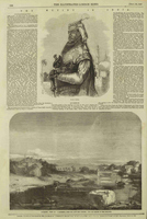

Whether Thomas Harrington Wilson, the draftsman whose signature is visible on the ILN image, was acquainted with the watercolor of Bahadur Shah Zafar is largely immaterial for my purposes. That he was likely unaware of it—or of any images of Bahadur Shah Zafar—confirms the prevalence of what Shaffer refers to as the “steady replication of readily identifiable forms” that “wander.”[69] In the upper body, three-quarter view and the gaze into the middle distance of the men in the two images, we see the circulation of compositions and conventions between portraiture and newspapers. Indeed, this pose—waist-up or elongated to full-length—had become the standard format for an Indian elite, whether in portraits by European artists like Zoffany, by Indian artists such as Chitrakar, by Queen Victoria’s artist Winterhalter, or in prints.[70] The exception to this format in my sample thus far is the image of the Raja of Travancore (see fig. 10), in which he appears in full-frontal view, gazing directly at the viewer; it is also the single image that eschews linear perspective.
Iconographically, too, both the watercolor of Bahadur Shah Zafar and the ILN’s image of Nana Sahib sport a similar motif to convey elite status: the jeweled ornament or sarpech fastened on the turban, topped with a plume or feather. Though in Wales’s oil painting of the Maratha peshwa from the 1790s (see fig. 5) the seated elites sport a sarpech on their headdresses but not a plume, even the most cursory glance at eighteenth- and nineteenth-century portraits of Indian elites brings up a plethora of sarpech-adorned headdresses topped with plumes.[71] The feather appears in the coronation portrait of Bahadur Shah Zafar by Ghulam Ali Khan (ca. 1837; collection of Stuart Cary Welch); in the famous portraits of the Nawab of Arcot by Tilly Kettle (1772–76; Victoria & Albert Museum, London) and George Willison (ca. 1774; British Library, London); and in Chitrakar’s portrait of Jung Bahadur from 1850 (see fig. 2).[72] It would require another article to trace this motif in Indian portraiture, but for my purposes the “feather in the cap” became a standard flourish of elite status, traveling from court to court along the subcontinent. By the mid-nineteenth century, London’s illustrated press had settled on that feathered flourish to mark elite status as well: it appears atop the heads of the Maratha Nana Sahib (see fig. 14), the Sikh Raja of Patiala (see fig. 9), and the Raja of Travancore in southern India (see fig. 10). In portraits and prints in India and Britain, the feather on the turban became a marker of Indian elites, regardless of whether the elite was Sikh, Maratha, Mughal, Nepalese, or from southwestern India.
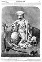
On the very day the ILN published its dubious image of Nana Sahib (the image bears little resemblance to textual descriptions of the man, and the palm trees, domes, and minarets telescope its Orientalizing imagination), its rival and Vizetelly’s second challenge to the ILN, the Illustrated Times, ran an image that it, too, claimed was of Nana Sahib (fig. 16). The man pictured here could not be more different from the ILN’s Nana Sahib. (That two such patently different men could appear as Nana Sahib without comment is a tip-off to British racism that either did not see the differences or viewed Indians as interchangeable). The captioned title under the wood engraving in the Illustrated Times includes the following words: From a Picture Painted at Bhitoor, in 1850, by Mr. Beechy, Portrait Painter to the King of Oude. George Duncan Beechey (1798–1852)—the newspaper misspelled his name—was the son of Sir William Beechey and Anne Jessop, portrait painters at the Royal Academy. George landed in India in 1828, wound his way to the court of Awadh, and by 1837 was Royal Portrait Painter to the nawab of Awadh, Wajid Ali Shah (see fig. 13). How Beechey might have met Nana Sahib and the circumstances under which the portrait came to be is unknown. In 1851, Beechey shipped his belongings and twenty-five years of work to England, only for them to sink at sea. It is unclear how the Illustrated Times laid hands on Beechey’s painting of 1850 or a sketch of it to rework it into a wood engraving in 1857. Like the ILN image of Nana Sahib, this one, too, should be viewed, to use Eaton’s deft formulation, as a “simulacrum . . . cut free from a lost original.”[73] My concern here is not to sleuth their origins but to use these images of Nana Sahib to unpack the recurrence of compositions and visual conventions between portraits and newspaper images.
While the source for the Illustrated Times’ image of Nana Sahib is missing, placing it beside Wales’s oil of 1792 (see fig. 5) proves illustrative. Though sixty years separate the images, and though one is a group portrait and the other a portrait of an individual, they share details, composition, and iconography. The elites in both are seated on the floor on a patterned carpet with one hand placidly placed on a knee, and the men in both are wearing a white muslin angarkha (tunic) with a shawl draped over one shoulder. Likewise, both seated men in Wales’s painting and in the Illustrated Times’ image of Nana Sahib have a tilak or prayer mark on the forehead. Though Nana Sahib’s turban lacks ornaments, all three men are wearing the Maratha saucer-shaped pagri. While the Illustrated Times’ image depicts Nana Sahib frontally and staring directly at the viewer, Wales’s peshwa and minister are depicted in views somewhere between three-quarter and full-frontal, and they also gaze away from the viewer. As we have seen, frontality was a European import, but in its adoption in India, its significance, Shaffer argues, took on new meanings: “Frontality in royal portraiture [functioned] as a compromise between the divine and the human figure that may have resulted from an indigenous engagement with European portraiture.”[74] Though we do not know for certain, it is possible that the frontal view in Beechey’s portrait of Nana Sahib was the outcome of a similar collaboration between artist and sitter. Both images certainly speak to that break with the long-standing Mughal tradition of presenting the sitter in profile that, over the course of subcontinental artists’ long engagement with European traditions, was almost totally abandoned by the mid-nineteenth century.
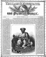
The broader differences between these images are illustrative of the widely different circumstances under which they were produced. As Shaffer shows, Wales’s group portrait was the result of collaboration and negotiation between the peshwa’s retinue and the artist, and was in a style that amalgamated Mughal, Maratha, and English visual modes. Sixty years later and a continent away, draftsmen were not collaborating with their subjects and were at a second- or third-hand remove from those they were representing, while engravers were literally working in fragments. As a result, while visual tropes persisted across media, small shifts in details telegraph a break in process and collaboration. The Marathas in both Wales’s oil and the Illustrated Times’ print have a long sword, but in the former’s collaboratively crafted image the tip of the sword is cut off by the painting’s edge, its power merely implied. Nana Sahib’s sword in the image in the Illustrated Times, by contrast, appears in full, a necessary accessory for the arch-villain of 1857. That said, the threat of that sword, its curve hugging the carpet’s pattern such that the weapon is virtually lost, is visually diminished. At the height of the Uprising, Britons needed the illusion of strength; the “fiend’s” weapon appears, but as an ornamental, sword-as-accessory rather than as a weapon. Altogether, the effect of the nosegay, jeweled slippers, hookah (for Britons, a symbol of decadence, degeneracy, and dissoluteness), pudgy face, and unfocused eyes is of an effete and emasculated figure. Indeed, so effete was this image that the Lady’s Newspaper and Pictorial Times—also owned by the proprietor of the ILN and thus a rival to the Illustrated Times—when it filched the image a few months later, unsubtly revised it (fig. 17). “The Butcher of Cawnpore’s” hand that holds the hookah is now a fist, and the sword no longer ornamental.
Conclusion
The scholarly literature on cut-and-paste journalism has long presumed that it was always and only the “provinces” pilfering from a “metropole.” This article has illustrated the reverse: London’s illustrated newspapers of the midcentury freely borrowed not only individual elements but also a visual iconography from Indian portraiture. In some cases, newspapers repurposed an existing image (as that of Jung Bahadur); in others they copied or quoted a specific item or motif (the feather atop the sarpech); and in yet others they borrowed a compositional style (the three-quarter view of a figure). Some of these elements were developed by British artists working in India, others by Indian artists engaging European styles and clientele. As Shaffer, Eaton, and others have shown, the replication of forms was a feature of Indian portraiture itself. Extracted from the contexts in which these portraits were (sometimes collaboratively) produced, wood-engraved images in London’s newspapers replicated—and replicated with a difference. The many hands images passed through ensured that what appeared on the page was never, even broadly speaking, a facsimile. Instead, images on the newspaper page reproduced stereotyped imaginaries and fulfilled political desires: a placid hand on a lap became a fist; a pale watercolor background was filled in with palm trees, minaret, and domes.
This article has highlighted two “journeys”: the first when Indian artists incorporated European forms and styles and the second when the work of Indian artists was incorporated by British newspapers. Between the 1790s, when a style of portraiture that represented “indigenous engagement with European portraiture” emerged in India, and the mid-nineteenth century, when illustrated newspapers in Britain copied from such portraits, “indigenous engagement” was erased.[75] This erasure of Indians mirrored the diminishment or erasure of most wood engravers in London’s workshops. While newspapers sought to make the elites of Britain’s Indian empire visible, they did so by diminishing if not erasing the chain of labor and the hands, Indian and British, that made these portraits possible. The process of image production for mass consumption, with its many remediations, relied on a labor hierarchy in which the closer the worker was to the fine art of painted portraiture the higher their prestige. This article has sought to shed light on—and where possible, recover—the erasure of the many hands that created transmedial images. Foregrounding the material process of the production of images, including the engraving-shop practice of literally splitting an image into parts, underscores the ways fragmented and alienated labor was a necessary condition for the reproduction of an imperial ideology that made labor invisible in both India and Britain.[76]
Acknowledgments
I would like to thank the two anonymous readers at NCAW for their astute and generous comments that helped me tighten the strands of my argument into a neater braid. I am also grateful to Thomas Smits, who used his open-source image dataset to help me sort through the confusing plethora of images of Bahadur Shah Zafar in Britain’s illustrated press. Finally, I thank Matthew Stephens, who generously sent me photographs of Bahadur Shah Zafar from his personal copy of the Illustrated News of the World, a scarce commodity.
Notes
The transliteration of Indian words and names can be inconsistent. For proper names, I have opted for the spelling used by those in the relevant communities. Thus: “Chitrakar,” not “Citrakar,” for the Nepalese artist; “Duleep,” as the Sikh heir signed his name, not “Dhuleep”; and “Awadh,” not “Oude,” for the principality in India.
Epigraph: Emily Eden, Up the Country: Letters Written to Her Sister from the Upper Provinces of India, ed. Edward John Thompson (London: Virago, 1983), 264. First published in 1866.
[1] Attempting to sketch the complex of Sikandra, in Agra, Eden wrote on December 20, 1839, “it is impossible to make anything of these elaborate Mogul buildings, they are all lines and domes, and uncommonly trying to the patience.” Eden, Up the Country, 359.
[2] Tom Young, Unmaking the East India Company: British Art and Political Reform in Colonial India, c. 1813–1858 (New Haven, CT: Yale University Press, 2023), 56. British art educators throughout the century subscribed to the belief that Indians were “imitative” copyists, incapable of representation and good only in the decorative arts. John Ruskin opined: “[The Indian] will not draw a form of nature but an amalgamation of monstrous objects.” Quoted in Partha Mitter, Art and Nationalism in Colonial India, 1850–1922: Occidental Orientations (Cambridge, UK: Cambridge University Press, 1994), 32.
[3] Charles Knight’s The Penny Magazine (1832–45) debuted a decade earlier and included images that grew in number and size over the course of its run. Knight’s target audience was working-class readers, and the periodical’s images were largely educational and, to avoid the stamp tax, not topical.
[4] On Knight’s skepticism about the ILN’s ability to print both news and images while remaining “fresh,” see Paul Fyfe, “A Great Exhibition of Print: Illustrated London News Supplement Sheet (1851),” in “Object Lessons: The Victorians and the Material Text,” special issue, Cahiers Victoriens et Édouardiens 84 (Autumn 2016): 8.
[5] “The Nepaulese Embassy,” Illustrated London News, June 8, 1850, 402.
[6] Today the portrait hangs in the Asia and Africa Reading Room of the British Library in London. For an account of its provenance, see the narrative by Jung Bahadur’s great-granddaughter, Mrs. Mayura Brown, in Michael Scott, “A Portrait of an Ancestor or a Portrait Saved,” Britain-Nepal Society Journal, no. 23 (1999): 11–12, https://himalaya.socanth.cam.ac.uk/.
[7] Rodney K. Engen, Dictionary of Victorian Wood Engravers (Teaneck, NJ: Chadwyck-Healey, 1985), 6.
[8] As an index of Anelay’s regard, when the ILN received a daguerreotype of the abolitionist Harriet Beecher Stowe, it commissioned Anelay to translate it into a sketch for carving; the resulting wood engraving appeared as Mrs. Harriet Beecher Stowe, Author of ‘Uncle Tom’s Cabin’ From a Daguerreotype Taken at New York, Illustrated London News, January 15, 1853, 48. For Smyth, see Engen, Victorian Wood Engravers, 244. Smyth did most of the illustrations for the ILN’s anniversary edition of 1843 as well as an eight-foot-long supplement, Panorama of the River Thames in 1845.
[9] His Excellency Jung Bahadoor Riding Up a Granary at Patna, Illustrated London News, June 8, 1850, 416.
[10] Eden, Up the Country, 264.
[11] Eden, Up the Country, 263 (emphasis added). Eden’s notion that Azim could “only copy” and not originate was the bedrock belief of art educators in Britain and India. Mitter discusses Richard Redgrave, whose curriculum in South Kensington was “obsessed with copying” and was imported to India in the 1860s. Mitter, Art and Nationalism, 36.
[12] Rosalind Krauss, “Retaining the Original? The State of the Question,” in Retaining the Original: Multiple Originals, Copies, and Reproductions, ed. Kathleen Preciado (Washington, DC: National Gallery of Art; Hanover, NH: University Press of New England, 1989), 8.
[13] Caroline Karpinski, “The Print in Thrall to Its Original: A Historiographic Perspective,” in Preciado, Retaining the Original, 104.
[14] Karpinski, “Print in Thrall,” 106, 101. In Rubens’s career, we see both parity and hierarchy: he supervised a workshop of engravers who made prints after his paintings, which he distributed and sold to grow his international reputation. William M. Ivins, Prints and Visual Communication (Cambridge, MA: MIT Press, 1969), 72–73.
[15] Ivins, Prints, 72–73.
[16] Analytic bibliography compares print copies that are notionally the same, yet seldom are in fact.
[17] The literature on copyright is extensive. Relevant for this article is the volume of essays on the development of Anglo-American copyright for engravings, etchings, sculpture, and architecture following the Statute of Anne of 1709: Marie-Stéphanie Delamaire and Will Slauter, eds., Circulation and Control: Artistic Culture and Intellectual Property in the Nineteenth Century (Cambridge, UK: OpenBook Publishers, 2021).
[18] Vishakha N. Desai, “Reflections of the Past in the Present: Copying Processes in Indian Painting,” in Perceptions of South Asia’s Visual Past, ed. Catherine B. Asher and Thomas R. Metcalf (New Delhi: American Institute of Indian Studies, 1994), 135.
[19] Natasha Eaton, Mimesis across Empires: Artworks and Networks in India, 1765–1860 (Durham, NC: Duke University Press, 2013), 156. Branfoot notes that “European prints were already in circulation at the Mughal court in the 1550s prior to the Jesuit missions of the 1580s when European art acted as the catalyst to further innovation in Mughal painting.” Crispin Branfoot, “Introduction: Portraiture in South Asia,” in Portraiture in South Asia Since the Mughals: Art, Representation and History, ed. Crispin Branfoot (London: I. B. Tauris, 2018), 5.
[20] Susan Stronge, “Portraiture at the Mughal Court,” in The Indian Portrait, 1560–1860, ed. Rosemary Crill and Kapil Jariwala, exh. cat. (London: National Portrait Gallery, 2010), 27.
[21] Stronge, “Portraiture,” 27. Identification-by-emblems held true for Hindu artists in Rajput courts as well. Rosemary Crill writes: “Traditional Hindu concepts of portraiture, such as they were, were more concerned with the attributes of kingship and the strength of a ruler’s authority than with an individual’s personality or outward appearance. When human figures were used in illustrations to Hindu texts they were stereotypical images, whether of kings and queens or demons and gods.” Rosemary Crill, “Portraiture at the Rajput Courts,” in Crill and Jariwala, The Indian Portrait, 1560–1860, 33.
[22] Stronge notes that the “increasingly naturalistic depiction of faces” did not extend to women: “when women are depicted, they tend to be types, their features as formulaically repetitive as their jewellery.” Stronge, “Portraiture,” 29, 30.
[23] J. P. Losty, “Indian Portraiture in the British Period,” in Crill and Jariwala, The Indian Portrait, 1560–1860, 41, 47. Branfoot cautions against overemphasizing the impact of the European encounter: “The development of portraiture was an aspect of this characteristic Mughal interest in historical and observational documentation. The emergence of Mughal portraiture cannot simply be ascribed to the arrival of Europeans and their visual culture. The established Indic conventions of portraiture in South Asia—evident in inscriptions, literature and sculpture . . . —and the assimilation of ideals and conceptions from the wider Persianate world to which the Mughals belonged were also important factors.” Branfoot, “Introduction,” 6.
[24] Stronge, “Portraiture,” 27–28.
[25] Losty, “Indian Portraiture,” 42.
[26] Losty, “Indian Portraiture,” 43. Complicating any discussion of subcontinental artists’ adoption or rejection of European styles is that artists in many non-Mughal courts encountered Mughal, not European styles. Branfoot writes that “in the seventeenth century, the artists of the Rajput courts of Rajasthan and the Pahari hills selectively adapted and assimilated Mughal naturalism, some states fully embracing Mughal styles, while others were slow to attempt any forms of portraiture.” Branfoot, “Portraiture,” 11. In the nineteenth century, Tom Young shows, the Sikh ruler Ranjit Singh borrowed “a conception of royalty as an object of ritualised viewing” from Mughal rulers and texts. Young, Unmaking, 148.
[27] Eaton, Mimesis, 3.
[28] In addition to the scholars discussed above, see Young, who writes of the “strategic forms of cultural adoption, reinvention and renewal” that occurred in Sikh, Rajput, and Mysore courts as rulers crafted their roles “in relation to contemporary exigencies and past legacies.” Young, Unmaking, 150.
[29] Maya Jasanoff, “A Passage through India: Zoffany in Calcutta and Lucknow,” in Johan Zoffany RA: Society Observed, ed. Martin Postle (New Haven, CT: Yale University Press, 2011), 134.
[30] Jasanoff, “Passage,” 137. For a discussion of other European artists in Indian courts who appropriated stylistic elements from Mughal art, see Eaton, Mimesis, 168–82.
[31] Cited in Holly Shaffer, “‘Take All of Them’: Eclecticism and the Arts of the Pune Court in India, 1760–1800,” The Art Bulletin 100, no. 2 (2018): 78.
[32] Shaffer, “Take All,” 80–81.
[33] Eaton, Mimesis, 3.
[34] Ryan Cordell, “Viral Textuality in Nineteenth-Century US Newspaper Exchanges,” in Virtual Victorians: Networks, Connections, Technologies, ed. Veronica Alfano and Andrew Stauffer (New York: Palgrave Macmillan, 2015), 29–56; Priti Joshi, “Scissors-and-Paste: Ephemerality and Memorialization in the Archive of Indian Newspapers,” Amodern, no. 7 (December 2017), http://amodern.net/; and Stephan Pigeon, “Steal It, Change It, Print It: Transatlantic Scissors-and-Paste Journalism in the Ladies’ Treasury, 1857–1895,” Journal of Victorian Culture 22, no. 1 (2017): 24–39.
[35] Thomas Smits, The European Illustrated Press and the Emergence of a Transnational Visual Culture of the News, 1842–1870 (New York: Routledge, 2019), 3.
[36] Fyfe, “Great Exhibition,” 7.
[37] Typographic Advertiser, March 1, 1863, 77 (wood engraving titled Wood’s Wood Engraving Establishment).
[38] Stevens notes that even in the higher-prestige book-illustration business, engravers often remained unnamed, citing as an example the Dalziel firm, whose signature stood in for the labor of a vast crew of engravers. Bethan Stevens, The Wood Engravers’ Self-Portrait: The Dalziel Archive and Victorian Illustration (Manchester: Manchester University Press, 2022), 84.
[39] Michael Twyman, The British Library Guide to Printing History and Techniques (Toronto: University of Toronto Press, 1998), 52.
[40] Ivins, Prints, 98.
[41] Henry Vizetelly, Glances Back through Seventy Years, vol. 1 (London: Kegan Paul, Trench, Trübner, 1893), 233–34. In copying not from nature but from another graphic, Vizetelly was drawing on a venerable European tradition. The Nuremberg Chronicle (1493) repurposed the identical woodcut for multiple cities, in one case for eleven separate towns. Ivins, Prints, 38. In fifteenth-century Europe, Ivins writes, “the general attitude . . . towards the difference between first- and second-hand visual information is shown by the fact that Carpaccio, the great Venetian painter, was content . . . to copy from Rewich’s view of Venice rather than to draw the buildings directly for himself.” Ivins, Prints, 38.
[42] Fyfe notes that in midcentury, “the ILN’s audience neither expected nor measured woodcut illustrations by photographic standards.” Fyfe, “Great Exhibition,” 15n16. Yet, as Vizetelly’s confessional tone in the anecdote suggests, in the fifty years between the 1840s and 1890s, the pressure to offer “visual facsimiles or photorealistic illustrations” became the norm. Fyfe, “Great Exhibition,” 9.
[43] Ivins, Prints, 99 (emphasis in original). Fyfe describes the process at the ILN as an “elaborate manipulation of images from initial sketch to final impression,” one in which engravers were comfortable “correcting and changing sketches.” Fyfe, “Great Exhibition,” 7, 15n16. Ivins adds: “Reproductive prints and illustrations contained far more of the linear syntaxes and shop practices of their places and times of production than they did of the detail or character of the originals they purported to represent.” Ivins, Prints, 172. In other words, the reproduced image paid more fealty to house style or the grammar of its form than to any original it drew from.
[44] Ivins, Prints, 67.
[45] Julie Codell and Linda K. Hughes, “Introduction,” in Replication in the Long Nineteenth Century: Re-makings and Reproductions, ed. Julie Codell and Linda K. Hughes (Edinburgh: Edinburgh University Press, 2018), 3, 11. Fyfe too, though accepting that ILN images were “manipulated,” considers such interventions as providing image makers room to “artfully adapt,” which was foreclosed with “facsimile illustration.” Fyfe, “Great Exhibition,” 11.
[46] Priti Joshi, “Periodic Transactions: The Indian Press Repurposes the British” in Routledge Companion to Global Victorian Literature and Culture, ed. Sukanya Banerjee and Fariha Shaikh (London: Routledge, forthcoming).
[47] “History of Wood-Engraving,” Illustrated London News, supplement, July 6, 1844, 425. Though the authors use “wood-cut” and “wood-engraving” interchangeably, in fact the images in the ILN were wood engravings.
[48] On “rats” see Stevens, Wood Engravers’ Self-Portrait, 348–50.
[49] In 1839 Eden had written that she did not want her sketches “to be common,” but she was not averse to making them more widely available. Eden, Up the Country, 264. In Britain, she availed herself of the respectable format of a portfolio: Portraits of the Princes & People of India (London: Dickinson & Son, 1844) consisted of twenty-four plates “drawn on the stone” by Lowes Cato Dickinson. (The album is digitized here and Eden’s image of the raja can be viewed here).
[50] “The Raja of Putteealla, on His State Elephant,” Illustrated London News, January 6, 1844, 5.
[51] Untitled essay, Illustrated London News, April 18, 1846, 257.
[52] See the painting of 1835–39 that depicts the Sikh ruler Ranjit Singh on a horse in Young, Unmaking, 146.
[53] Stronge, “Portraiture,” 29.
[54] Losty, “Indian Portraiture,” 44. Ghulam Murtaza Khan worked in the Mughal court; the shift away from strict profile, Losty writes, “took a lot longer to reach the Punjab and the splendid Lahore court of the Sikhs. . . . The resultant stiff style was suddenly loosened in the 1840s on exposure to direct foreign influence.” Losty, “Indian Portraiture,” 47.
[55] Molly Emma Aitken, “Colonial-Period Court Painting and the Case of Bikaner,” Archives of Asian Art 67, no. 1 (April 2017): 27.
[56] Losty, “Indian Portraiture,” 47. The shift from profile to three-quarter and full-frontal views occurred unevenly across regions of the subcontinent. Losty writes that though the shift away from profile views “had been going on since the late eighteenth century,” it was only in the early nineteenth century that artists in the Gangetic valley from Bengal to Delhi abandoned strict profile views and silhouetted bodies, while artists in the Sikh courts of Lahore moved away from profile views in the 1840s. Losty, “Indian Portraiture,” 47. In the Rajput court of Bikaner, Aitken writes, portraits in strict profile gave way to front-facing views in the 1850s. Aitken, “Colonial-Period Court Painting,” 27. Two images of Bahadur Shah Zafar, the last Mughal emperor, capture this shift: in a portrait of the 1790s, the young emperor is pictured in full profile. See William Dalrymple, The Last Mughal: The Fall of a Dynasty: Delhi, 1857 (New York: Vintage Books, 2006), betw. 164 and 165. Less than a half century later, in his 1837 coronation portrait by Ghulam Ali Khan, Bahadur Shah Zafar appears in three-quarter view. William Dalrymple and Yuthika Sharma, eds., Princes and Painters in Mughal Delhi, 1707–1857, exh. cat. (New York: Asia Society Museum; New Haven, CT: Yale University Press, 2012), 177.
[57] Renate Dohmen, “Paintings, Prints and Popular Art in British India,” in Empire and Art: British India, ed. Renate Dohmen (Manchester: Manchester University Press; Cambridge: Open University, 2017), 60. See also Aitken, “Colonial-Period Court Painting,” 42. Mughal rulers adopted and adapted the Hindu practice of darshan into the practice of jharokha darshan, in which the ruler appeared in a balcony or window to be viewed by his subjects. Branfoot, “Portraiture,” 8. It is a sign of the syncretism of the subcontinent that in paintings of Mughal emperors at jharokha darshan, the ruler is almost always portrayed in profile. Branfoot, “Portraiture,” 15.
[58] The San Diego Museum of Art holds the watercolor this image is drawn from. Titled Ettanettan Tampuran, the Zamorin of Calicut, it is dated circa 1828, though no artist is listed. See “Collection,” San Diego Museum of Art, last updated December 17, 2024, https://collection.sdmart.org/.
[59] Engen, Victorian Wood Engravers, 231.
[60] For the sketch by Queen Victoria and the oil painting by Winterhalter, see Young, Unmaking, 140.
[61] Losty, “Indian Portraiture,” 42. The extent of Dulip Singh’s pictorial anglicization by his hosts is evident in Winterhalter’s portrait, in which the nonsensical outfit infantilizes the young man into playacting grandeur. See Young, Unmaking, 140.
[62] “History of the British Empire in India,” Illustrated London News, supplement, November 28, 1857, 538.
[63] Carpenter was primarily a watercolorist who traveled to India between 1850 and 1856.
[64] The image of a pipe attendant, but for its monochromic palette, bears all the marks of a Kalighat painting, the style that developed in colonial Calcutta circa 1850 when patuas, itinerant scroll artisans, settled in the city and adapted their forms for commercial purposes. See Pipe Attendant, Illustrated London News, November 28, 1857, 548.
[65] Stronge, “Portraiture,” 30.
[66] Will Slauter demonstrates that scissors-and-paste journalism was a common, accepted, and necessary practice of news gathering in the nineteenth-century Euro-American news business. Proprietary copyright laws in the last quarter of the century turned the screws on what had been a collaborative industry and introduced ownership of a “nonrivalrous” commons. Will Slauter, Who Owns the News?: A History of Copyright (Stanford, CA: Stanford University Press, 2019), 6.
[67] For discussions of the identity of the man in the ILN image, see Priti Joshi, “For Illustrative Purposes: Nana Sahib, Jotee Prasad and Representation in British and Anglo-Indian Newspapers,” in The Edinburgh Companion to British Colonial Periodicals, ed. David Finkelstein, David Johnson, and Caroline Davis (Edinburgh: Edinburgh University Press, 2024), 463–76; Andrea Kaston Tange, “Picturing the Villain: Image-making and the Indian Uprising,” Victorian Studies 63, no. 2 (2021): 193–223; and Brian Wallace, “Nana Sahib in British Culture and Memory,” Historical Journal 58, no. 2 (2015): 589–61. The ILN image circulated beyond newspapers: John Lang’s Wanderings in India (1859) included a version of it, and Robert Montgomery Martin’s The Indian Empire (1858) included the same image, with the sitter identified as “Kooer Sing” [Kunwar Singh]. Tange questions whether this could be an image of the aging Kunwar Singh. Tange, “Picturing the Villain,” 203–5. The collector Anil Relia, however, accepts it as his image. Anil Relia, The Indian Portrait – III: A Historical Journey of Graphic Prints up to Independence, exh. cat. (Ahmedabad: Archer House, 2014), 58.
[68] For the coronation portrait, see Dalrymple and Sharma, Princes and Painters, 177. Images of Bahadur Shah Zafar warrant a paper of their own, as confusion abounds regarding them. In The Last Mughal, Dalrymple includes a black-and-white image similar to the watercolor in figure 15 and writes that it appeared in the ILN, though he provides no date. Dalrymple, The Last Mughal, betw. 164 and 165. In fact, the only image of the “King of Delhi” that appeared in the ILN is an entirely different one. See ILN, October 10, 1857, 353. Another image similar to the watercolor in figure 15 appeared in the Illustrated Times (November 21, 1857, 344), and a steel engraving after the watercolor appeared as the frontispiece to Charles Ball’s History of the Indian Mutiny, vol. 2 (1858). A third image, also claiming to be of “The Ex-King of Delhi,” appeared in the short-lived Illustrated News of the World, a rival to the ILN, on March 20, 1858, 101. The man pictured in the ILN and Illustrated News of the World, with his full cheeks, would appear to be after portraits of Akbar II, Bahadur Shah Zafar’s father, from 1827. See Yuthika Sharma, “In the Company of the Mughal Court: Delhi Painter Ghulam Ali Khan,” in Dalrymple and Sharma, Princes and Painters, 45.
[69] Holly Shaffer, “Introduction: The Graphic Arts: Replication and the Force of Forms,” Ars Orientalis, no. 51 (2021): 1.
[70] A Google reverse-image search of the painting of Jung Bahadur (see fig. 2) makes this point explicitly: it results in a good sixty paintings of a full-length, turbaned Indian, facing left and leaning on a sword; only one of these is of Jung Bahadur.
[71] Ritu Kumar, the historian of Indian royal clothing, confirms that the jewel-encrusted sarpech was sometimes topped by a feather, sometimes not. Ritu Kumar, Costumes and Textiles of Royal India, ed. Cathy Muscat (Woodbridge, UK: Antique Collectors’ Club, 2006), 338, 152–53.
[72] Chitrakar, the Nepalese court artist, was clearly influenced by Zoffany, Kettle, and Willison, whose styles, forms, and use of paint and color he drew on.
[73] Eaton, Mimesis, 3.
[74] Shaffer, “Take All,” 82.
[75] Shaffer, “Take All,” 82.
[76] Though beyond the scope of this article, the establishment of and effacement of certain classes of labor was replicated in the Bengal School of Art in the early twentieth century as well. Guha-Thakurta writes: “The hierarchy was firmly set within the movement, whereby the artisan painter was credited with technical expertise in traditional methods of colour preparation and painting, but not with ‘original,’ creative talent.” As a result, Ishwari Prasad Varma, a descendent of a Mughal court artist, was reduced to the role of copyist when he was relocated to Calcutta. Tapati Guha-Thakurta, The Making of a New ‘Indian’ Art: Artists, Aesthetics and Nationalism in Bengal, c. 1850–1920 (Cambridge: Cambridge University Press, 1992), 306. Mitter traces such divisions to a “Victorian hierarchy of art” that was introduced to India in the 1850s via art-school curricula; this hierarchy persisted in distinguishing between the fine and applied arts, and between mimetic or representational and abstract or decorative art. Mitter, Art and Nationalism, 52.