James McNeill Whistler
Reviewed by Barbara Dayer GallatiBarbara Dayer Gallati
Curator Emerita, Brooklyn Museum
Email the author: barbaragallati[at]googlemail.com
Citation: Barbara Dayer Gallati, exhibition review of James McNeill Whistler, Nineteenth-Century Art Worldwide 25, no. 3 (Autumn 2026), https://doi.org/10.29411/ncaw.2026.25.3.22.
This work is licensed under a Creative Commons Attribution-NonCommercial 4.0 International License  unless otherwise noted.
Your browser will either open the file, download it to a folder, or display a dialog with options.
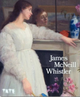
James McNeill Whistler
Tate Britain
May 21–September 27, 2026
Catalogue:
Carol Jacobi, ed.,
James McNeill Whistler.
Tate Publishing, 2026.
224 pp.; 200 color illus.; bibliography; notes; index.
£32.00 (softcover)
ISBN: 9781917055116
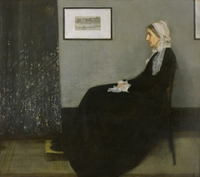
Tate Britain’s major exhibition, James McNeill Whistler, has understandably attained blockbuster status. As the largest European exhibition devoted to the artist since the Tate’s own magisterial retrospective in 1994, it marks the return of Whistler’s internationally famed Arrangement in Grey and Black No. 1: Portrait of the Painter’s Mother (fig. 1) to the city in which it was painted.[1] Although it is far from equaling the masterful achievement of the earlier exhibition, the present project is a satisfying mix of the expected and unexpected in that it includes not only key paintings but also rarely exhibited works that provide greater insight into the breadth of Whistler’s achievements, while navigating the problem posed by the absence of such significant paintings as Symphony in White, No. 1: The White Girl (1861–63; National Gallery of Art, Washington) and Nocturne in Black and Gold: The Falling Rocket (1875; Detroit Institute of Arts, Detroit).[2]
The roughly chronological arrangement of some 150 objects follows a traditional installation plan for a retrospective. However, the focus of the show originates from a fundamentally novel perspective in that it calls into play Whistler’s varied technical processes as they were shaped by his developing aesthetics. This innovative approach may be credited to a team of advisers led by Carol Jacobi, Tate Britain’s Curator of British Art, 1850–1915, whose emphasis on process was aided in no small measure by the Whistler’s Finish Research and Conservation Project, supported by The Lunder Foundation. Crucial, too, are the contributions from the exhibition’s co-organizers—the Van Gogh Museum, Amsterdam, and the Mesdag Collection, The Hague—to which the exhibition will travel under different titles.[3]
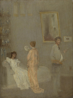
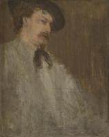
Even before entering the exhibition, the notion that process underpins the viewer’s experience was immediately apparent: the introductory didactic panel announced, “Through 50 years of painting, drawing, printmaking and design, [the exhibition] reveals the secrets of his experimental methods.” Once inside the exhibition proper, the visitors found themselves in a small, alcove-like space, facing a single painting, The Artist in His Studio (fig. 2). The object label for this painting covers relevant points—that the painting portrays Whistler at work in his studio, that as such it aligns with European iconographic tradition, and that it depicts blue-and-white East Asian ceramics. Yet the opening sentence—“Meet James Whistler.”—injects a somewhat annoying tone that reflects the dry label-writing style of “accessibility” preferred at the Tate. More annoying is that it states that the two women (Joanna Hiffernan and Emelie Jones) “relax in Japanese robes,” when, in fact, only Jones, the professional model, is dressed that way while Hiffernan wears a white dress recalling those she wore when posing for other paintings by Whistler. The two female figures introduce a secondary theme that flows through the exhibition, that of examining the roles that women (Hiffernan, Maud Franklin, Beatrice Godwin, Whistler’s sisters-in-law—Ethel Philip and Rosalind Birnie Philip—and, of course, his mother) performed in and out of the studio at various times over the artist’s career.
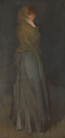
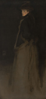
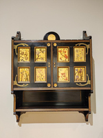
The Artist in His Studio is nonetheless an excellent prelude to the first gallery, devoted to Whistler’s studio environment. Dominating one end of the room are two full-length portraits, Arrangement in Yellow and Grey: Effie Deans (fig. 3) and Arrangement in Black and Brown: The Fur Jacket (fig. 4), both of which portray Whistler’s mistress, the artist Maud Franklin. The rest of the gallery contains a selection of diverse objects, among them the artist’s easel and table palette, examples of Chinese Kangxi style ceramics from Whistler’s collection, Japanese prints, and a splendid wall cabinet designed by Beatrice Godwin, whom Whistler married in 1888 (fig. 5). The gallery, painted in a soft gray reminiscent of the color of Whistler’s studio walls, brings together elements critical to the premise of the exhibition by introducing significant sources of inspiration and the studio equipment Whistler used to bring his ideas to fruition.
The second gallery, titled “Origin Story,” provides a visual synopsis of Whistler’s artistic efforts during his boyhood in St. Petersburg, Russia, through to his early years in Paris, where he arrived in 1855. Of particular interest are the St. Petersburg Sketchbook (1844–48; The Hunterian, Glasgow), which was on public display for the first time, and examples of graphic work stemming from his teenage years in Pomfret, Connecticut, up to his departure for Europe in late 1855. For the most part, however, these items simply functioned as preliminary waystations in the course of the artist’s development. Works of greater artistic significance were in a subsection titled “Scenes from Bohemia,” where a selection of etchings from the Douze Eaux-Fortes d’Après Nature, published in 1858 and known as the “French Set,” was installed. Dedicated to his British brother-in-law Francis Seymour Haden, a talented amateur etcher himself, the so-called French Set is a product of Whistler’s art training at West Point and his brief stint working for the US Coast and Geodetic Survey, to which was added a complex chain of later influences—Haden, the etching revival then occurring in France, his study of Rembrandt van Rijn’s etchings, Charles Baudelaire’s call for realist subject matter drawn from ordinary life, and the impact of Gustave Courbet’s art.
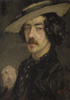
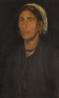
Whistler’s time in France wrought profound effects on his art. While his first professional endeavors were rooted in printmaking, his fluent French allowed for his easy interaction with French artists of his generation, especially Alphonse Legros and Henri Fantin Latour, who likely had a hand in convincing Whistler to devote more time to working in the oil medium. Oddly, the exhibition wall texts and the catalogue have nothing of substance to say about Whistler’s training at the Ecole Impériale et Spéciale de Dessin or his time in Charles Gleyre’s studio. Nevertheless, this gallery offers some real revelations—a group of early oils, including a self-portrait, on display for the first time since the artist’s death (fig. 6) and the recently securely attributed Head of a Peasant Woman (fig. 7). Rendered under the spell of realism, they possess the rough, unrefined surfaces that paralleled the bohemian life he led at the time.
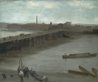
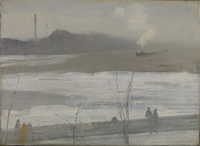
The third gallery, titled “Across the Water,” featured works executed after Whistler had quit France for London in 1859. The main didactic for the room declares that Whistler and his generation broke away from the realism of Courbet, preferring to concentrate on urban scenes of modern life, accomplishing that with rapidly applied brushwork. Indeed, the didactic declares, “Later this style would become famous as ‘impressionism.’” Highlighting the installation to make the point was a choice duo of Whistler’s oils, The Last of Old Westminster Bridge and Brown and Silver: Old Battersea Bridge (fig. 8), the latter of which seems better to predict his nocturnes rather than impressionism. A knotty problem arises with the use of the word impressionism, a term that did not come into use in relation to specific stylistic tendencies until 1874. As Richard Dorment observed, “By 1871 Whistler had arrived at a successful synthesis of realist and formalist elements to create a new kind of art which he called Impressionism but which we would label Aestheticism.”[4] Thus, the word could carry a multitude of meanings at the time, and its usage here was potentially misleading. With the exhibition’s emphasis on process, the label writers appeared determined to position Whistler’s art as something that was always en route toward something else. A case in point was the label text for Chelsea in Ice (fig. 9), which states that Claude Monet “soon followed” in depicting the fogs of London and that the painting was “an early step towards abstraction.” This approach suggests that the organizers felt a need to appreciate the work, not for what it is, but for what it anticipated.
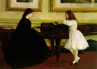
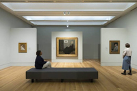
Gallery 4, bearing the title “Breaking In, Breaking Up,” concentrated on Whistler’s acceptance and later rejection by the mainstream cultural sector. Immediately to the left of the entrance was At the Piano (fig. 10), an important early work portraying Whistler’s half-sister, Deborah Haden, and her daughter. The painting attracted significant praise when it was shown in London and Paris, as exemplified by Sir Charles Eastlake’s opinion that it was the “finest piece of painting in the Royal Academy.”[5] The family theme was continued at the far end of the room with the famed portrait of the artist’s mother, flanked by portraits of her two surviving sons (fig. 11), Arrangement in Grey: Portrait of the Painter to the right and Portrait of Dr. William McNeill Whistler to the left (fig. 12). This small group of family portraits, executed over roughly the same period, goes far in making clear Whistler’s increasing reliance on a subdued tonal palette and thinly applied, yet sometimes active paint surface that suggests rather than defines form. Wall texts emphasized that the paintings of the early 1870s mark Whistler’s first use of the term arrangement in the titles of his paintings. These “arrangements” were joined by works carrying other music-related titles—harmonies, symphonies, and nocturnes—a move that suggested that his thinking relied on an element of synesthesia that may have sprung from his reading of Baudelaire’s sonnet, “Correspondances,” published in Les Fleurs du Mal in 1857.[6] In this connection it seems that Whistler’s aesthetic goals maintained strong roots in French literature just as they did in the constantly shifting formal developments shaping the “New Painting,” as it came to be called.[7]
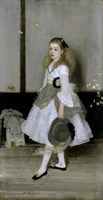
Other family connections emerge, this time with two works showing a pair of sisters—Harmony in Grey and Green: Miss Cicely Alexander (fig. 13) and Miss May Alexander (1874–75; Tate Britain, London). Both portraits testify to the artist’s persistent working and reworking of the paint surface as he strove to create an art that went beyond mere portraiture to attain aesthetic significance in and of itself.
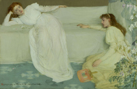
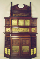
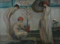
Gallery 5, “Butterfly World,” took its cue from Whistler’s distinctive butterfly monogram and concentrated on the artist’s incorporation of East Asian aesthetics with contemporary western subject matter as well as his growing use of musical terms in the titles of his works. The stated goal was well made here inasmuch as the installation included East Asian objects as well as works by Whistler that vividly demonstrated the aesthetic fusion he desired. However, the complexity of Whistler’s development in this respect is overly simplified since it ignores his sophisticated reliance on classical tradition, as revealed in such works as Symphony in White, No. 3 (fig. 14), which was likely inspired by the art of his friend Albert Joseph Moore, who in turn drew on classical antiquity for his art.[8] The section also touches on Whistler’s abiding interest in interior design, namely with the inclusion of Harmony in Yellow and Gold: The Butterfly Cabinet (fig. 15) and Three Figures: Pink and Grey (fig. 16), the latter of which is the copy the artist made of one of the paintings for the “Six Projects,” an aborted interior design project for his patron, the wealthy shipowner Frederick Leyland. With respect to the cabinet, Whistler had been engaged by the architect Edward William Godwin (the architect hired by the artist to design his “White House” on Tite Street) to decorate a fireplace and surrounds for William Watt & Co., at whose stand it was displayed at the Exposition Universelle of 1878.[9] The cabinet, as it currently exists, is no longer a fireplace having had doors attached to cover the opening. The introduction of this aspect of Whistler’s design activity would have been an ideal moment to draw attention to the superb frames he designed for his own art—themselves aesthetic objects intended to achieve visual unity with the works within them and the decor of the spaces they occupied.
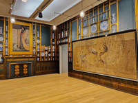
Halfway through the exhibition was a recreation (fig. 17) of the celebrated Harmony in Blue and Gold: The Peacock Room, which is permanently installed in the Freer Gallery of Art, Washington. Whistler’s passion for interior design could not be ignored in the exhibition, nor could reference to Whistler’s mercurial temperament be omitted since it stoked the fiery end to Whistler’s and Leyland’s friendship that arose out of an argument about The Peacock Room. It is regrettable that the effect of the recreation is overwhelmingly garish. Admittedly, this is something that could not have been avoided given the challenges presented by the gallery’s scale, lighting problems, ceiling height, and light-colored flooring, all of which worked against an attempt to recreate an interior originally destined for a domestic space. Perhaps it would have been better to install the one original work in the recreation that relates to the commission—Cartoon of Rich and Poor Peacocks (visible in fig. 17)—with photographs of the actual room.
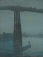
Gallery 6, “Nocturnes,” traces the development of Whistler’s series of works that he designated as the equivalents of musical compositions evoking the sensibility of night. Born of his observations of warships in the Valparaiso Bay during his trip to Chile in 1866, the smooth, liquid surfaces of the paintings approximate the cool stillness of the waters viewed through an atmospheric envelope. This stylistic shift intensified in the early 1870s, when the artist expanded his exploration of the nocturne theme to feature visions of the Thames and its banks. Here the fireworks in Nocturne in Blue and Gold: Old Battersea Bridge (fig. 18) stand in for those in the absent Nocturne in Black and Gold: The Falling Rocket in order to introduce the narrative of Whistler’s lawsuit against John Ruskin, an undertaking that ended in a pyrrhic victory that brought Whistler’s financial ruin and prompted his flight from London to Venice.
Gallery 7, “Going Away,” focuses on Whistler’s wide-ranging travels throughout his career, particularly with respect to his sojourns in Venice, Holland, and Algiers. Among these small works are etchings from the “First Venice Set,” a commission from the London Fine Art Society, which financed Whistler’s time in Venice. The etchings were displayed as closely to Whistler’s original requirements for their 1880 exhibit at the Fine Art Society as possible, with uniform white frames on plain white walls. Other less familiar works executed in a variety of media documented his travels.
Gallery 8, “Battles for Beauty,” highlighted the artist’s campaign of aggressive self-promotion and his strenuous rebuttals to the critical slings and arrows aimed at his art. At the heart of the room is a video showing the noted British actor Anton Lesser in the guise of the artist as he presented readings from Whistler’s “Ten O’Clock” lecture. The video effectively underscored the artist’s celebrity status and famously acerbic wit. Examples of Whistler’s publications, including The Gentle Art of Making Enemies, were displayed nearby in a case above which appeared a characteristic quote from the artist: “I’m not arguing with you—I’m telling you.”
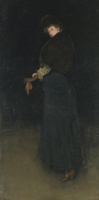
The final gallery, “Arrangements in Black,” directed the viewer to consider the artist’s return to painting society portraits in the 1880s, a pursuit that achieved for him a level of hard-won international success that he had not truly enjoyed since the exhibition of The White Girl (later titled Symphony No. 1: The White Girl) at the Salon des Réfusés in 1863. Perhaps by coincidence, but possibly by design, Whistler’s early penchant for a white-on-white palette was turned on its head as he portrayed his subjects enveloped in perpetual darkness—a practice reflecting his admiration for Diego Velázquez’s prowess in expressing form through the subtle manipulation of shades of black. The demand for what Whistler called his “Arrangements in Black,” was reinforced when Arrangement in Black: La Dame au brodequin jaune (Portrait of Lady Archibald Campbell) (fig. 19) received a gold medal at the 1889 Paris Exposition Universelle.
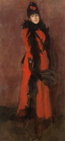
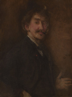
The subtheme concentrating on the women in Whistler’s life emerges powerfully in this gallery, where portraits of the artist’s sisters-in-law, Ethel Philip and Rosalind Birnie Philip, hold the far wall. Although the full-length Red and Black: The Fan (a portrait of Ethel) (fig. 20) is by far the most impressive of the three works, the modest The Jade Necklace (a portrait of Rosalind) carries the greatest impact in terms of her role as Whistler’s secretary and ultimately as his executrix. It was Rosalind, who knew that Whistler wanted to be remembered by Gold and Brown: Self Portrait (fig. 21), and it is entirely appropriate that the painting hangs near the door exiting the exhibition. Looking at the portrait, with its Rembrandtesque echoes and the red ribbon of the French Legion of Honor proudly displayed, one is tempted to try to resolve the artist’s public persona as a revolutionary, intractable modern with the man who was desirous of joining—and finally part of—the establishment against which he had fought for much of his career.
Overall, the exhibition fulfills its aims by providing an alternate way to survey Whistler’s oeuvre. An understanding of his technical and theoretical processes is augmented intermittently by ancillary wall texts that amplify the concepts of finish and provide some comments about recent discoveries in conservation labs. What is lacking, however, is a balance between the emphasis on process and a more traditional assessment of Whistler’s career that would aid in contextualizing his stylistic choices. An effort to this end was made by including examples of works by a few of Whistler’s somewhat minor contemporaries. For instance, Walter Greaves’s Old Battersea Bridge (1874; Tate Britain, London) was installed next to two of Whistler’s paintings of the same subject executed approximately a decade earlier, a curatorial choice made to underscore Whistler’s stylistically advanced approach. It might have been preferable to include more works by Whistler’s French and British contemporaries to further illuminate the disparities or correspondences existing among them.
Similarly, the foregrounding of process as a prime objective within the exhibition might have been supplemented with more examples of Whistler’s stunningly fresh watercolors. A comparative investigation of the water-based medium and the paintings he created from the liquefied oils (or “sauces,” as Whistler called them) would have been instructive.
In the end, the exhibition reveals Whistler to be an artist of his time: quick to experiment, challenge rules, and manage his public image. What is needed, however, is a greater acknowledgment of Whistler’s awareness and application of the ideas permeating the intellectual network to which he belonged—starting with his friend Baudelaire’s “Correspondances”:
Like long-held echoes, blending somewhere else
into one deep and shadowy unison
as limitless as darkness and as day,
the sounds, the scents, the colours correspond.[10]
The exhibition is accompanied by a generously illustrated catalogue that includes twenty short essays by Jacobi and a large cohort of scholars. The essays cover a broad range of topics and, for the most part, address and amplify matters given sometimes fleeting mention in the exhibition. Kenneth Myers’s “Whistler and the Art of Design: Rooms, Exhibitions, and Frames,” provides a welcome and much-needed summary of Whistler’s theories of beauty in relation to design. Stimulating, too, is Alexis Clark’s “Gray Area: Reconstructing Whistlerian Paint and Politics,” in which Clark discovers in the trio of Whistler family portraits (see fig. 11) possible links between Whistler’s use of gray (in titles and in paint) and the family’s Confederate sympathies. Although purely speculative, the essay is thought-provoking and persuasive. Patricia de Montfort’s “Working Women and Social Life in Whistler’s Studio” sheds light on the lives of some of the women whose frequent presence in the artist’s studio has led to assumptions that they “seem without agency, serving only as components of his art” (156). To counteract that view, de Montfort stresses that the women in question—namely Beatrice Godwin Whistler, Maud Franklin, and Louise Jopling—were professional artists whose portraits he painted and whose careers he often supported. These working women not only sat for him, but they were also members of the social network that often attended the artist’s popular and highly publicized breakfasts, participating in the dynamic interplay of art and ideas that characterized these events.
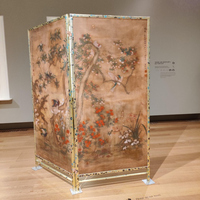
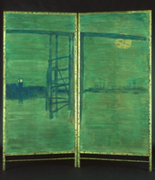
Ayako Ono’s “Whistler and Nampo: A Painted Screen,” deserves mention as a final example of the broad range of the catalogue essays. Ono focuses on an unusual two-paneled screen on one side of which are two paintings, Birds and Blossoms, Autumn 1867 (fig. 22) by the little-known female Japanese artist Nampo Joshi; on the reverse is Whistler’s Blue and Silver: Old Battersea Bridge (fig. 23). Ono’s research was two-pronged: one step was to look into the origins of Nampo’s paintings, presumably independent works that were never intended to be part of a screen; another was to determine how Whistler acquired the works and why he decided to attach his paintings to them within the framework of a screen. She concludes that Whistler probably purchased the Nampo paintings from the London art dealer Charles William Deschamps sometime around 1872. Ono goes on to theorize that Whistler’s knowledge of Kachō Fūgetsu, which translates to “flower, bird, wind (landscape), moon” (63), inspired him to join Nampo’s works featuring flowers and birds with his paintings of landscape and moon to complete the concept in a unique melding of Eastern and Western art in a single object.
As with any publication, there will always be glitches and the occasional editorial lapse can be found in the Whistler catalogue. For instance, in Anna Gruetzner Robins’s otherwise fine “In Memory of Whistler,” Washington Allston’s name is misspelled as Allstan (202). Another bothersome, but ultimately minor complaint rests with the reproduction of the book cover of The Gentle Art of Making Enemies (119); the image is so small that the cover is illegible.
Unfortunately, the organization of the catalogue leaves much to be desired. There were no figure numbers for the reproductions and no indication in the captions as to whether the works were in the exhibition. Moreover, the captions did not include the owners of the works. There is, at the back of the volume, a list of exhibited works headed by the caveat that it was correct at the time the book went to press. The list itself is arranged according to the date the art was made. This list, however, only applies to works by Whistler. There is a separate list for works by other artists, yet there is no entry for Nampo Joshi.[11] There is yet another list of nonexhibited works, but if the reader does not know whether the work in question was exhibited or not, it becomes necessary to consult several lists before gaining an answer. Trawling through these lists is frustrating and made even more so by the incredibly small print that even readers with excellent eyesight would find difficult to manage. Thus, the catalogue is valuable with respect to intellectual content, but it is unwieldy with regard to negotiating its labyrinthine arrangement.
Notes
[1] The Tate Gallery’s Whistler exhibition opened in October 1994 and traveled to the Musée d’Orsay, Paris, and the National Gallery, Washington. The show was accompanied by an impressive catalogue that continues to stand as a major resource in Whistler studies. See Richard Dorment and Margaret F. MacDonald, eds., James McNeill Whistler (Tate Gallery Publications, 1994).
[2] Symphony in White, No. 1: The White Girl was the centerpiece of The Woman in White: Joanna Hiffernan and James McNeill Whistler, an exhibition co-organized by the National Gallery of Art, Washington, and the Royal Academy of Arts, London. Shown at the Royal Academy in 2022, it is likely that the already well-traveled painting was not available for loan. As for Detroit’s Falling Rocket, conservation issues may have affected any discussions about the loan of the panel. It must be said, too, that every Whistler exhibition must do without loans from the Freer Gallery of Art, Washington, and the Frick Collection, New York.
[3] Whistler: Dandy and Disrupter will be on view at the Van Gogh Museum, Amsterdam, simultaneously with Whistler: Loving the Netherlands at The Mesdag Collection, The Hague, from October 16, 2026 to January 10, 2027.
[4] Richard Dorment, “James McNeill Whistler 1834–1903,” in Dorment and MacDonald, James McNeill Whistler, 18.
[5] See Dorment and MacDonald, James McNeill Whistler, 71–72.
[6] For the poem in the original French and in English translation, see Charles Harrison, Paul Wood, and Jason Gaiger, eds., Art in Theory, 1815–1900: An Anthology of Changing Ideas (Blackwell Publishers, 1998), 484–85.
[7] Charles S. Moffett discusses the terminology then in use in Paris, citing Edmond Duranty’s 1876 essay, “The New Painting: Concerning the Group of Artists Exhibiting at the Durand-Ruel Galleries,” which foregoes the use of the word Impressionism. See Charles S. Moffett, “Introduction,” in The New Painting: Impressionism 1874–1886, ed. Charles S. Moffett (The Fine Arts Museums of San Francisco, 1986), 19.
[8] For Moore’s influence on Whistler, see John Sandberg, “Whistler Studies,” The Art Bulletin 50, no. 1 (March 1968): 59–64. Sandberg states, “The importance of Moore for Whistler can hardly be overestimated, for in the years between 1865 and 1870 . . . [Moore], and through him the classical tradition, was by far the most significant influence upon the American.” Sandberg, “Whistler Studies,” 59. See also Cristina Santarelli, “From A Musician to A Quartet: Albert Moore between Classicism and the Aesthetic Movement,” Music in Art 40, nos. 1–2 (Spring/Fall 2015): 245–54. Santarelli covers the relationship between the two artists in the context of classicism.
[9] See The Paintings of James McNeill Whistler: A Catalogue Raisonné, YMSM 195, accessed August 16, 2026, https://whistlerpaintings.gla.ac.uk/.
[10] Harrison, Wood, and Gaiger, Art in Theory, 484.
[11] Blue and Silver: Old Battersea Bridge (the screen) is incorrectly listed under nonexhibited works by Whistler. There is no entry for Nampo Joshi in any of the lists, and there is no information regarding medium and support for her work.