

The browser will either open the file, download it, or display a dialog.

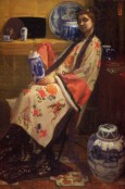
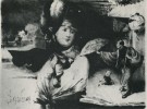
Following the succès de scandale of his White Girl, exhibited at the Salon des Refusés in 1863 as La Dame blanche, James McNeill Whistler's next bid for public attention and critical appreciation in Paris came in 1865, when his canvas entitled La Princesse du pays de la porcelaine (1864–65; fig. 1)[1] was hung at the Salon. Departing from the repetition of whites so notable in The White Girl, La Princesse du pays de la porcelaine is a painting replete with vivid colors in its representation of the screen, fans, porcelain, robes, and carpet that connote the mystified "land of porcelain" of its curious title. The artist's high ambitions for this work are promoted by its imposing size (199.9 x 116.1 cm), unlike the cabinet-picture dimensions of his other paintings of this period that similarly feature costumed women surrounded by a variety of East Asian objects: Purple and Rose: The Lange Leizen of the Six Marks (1864; fig. 2), Caprice in Purple and Gold: The Golden Screen (1864), and Variations in Flesh Colour and Green: The Balcony (ca. 1864–70).[2] Despite the importance of La Princesse du pays de la porcelaine in Whistler's oeuvre, this striking painting has, with several notable recent exceptions,[3] received less sustained analysis than one might expect from scholars of nineteenth-century European and American painting. One might surmise that the scholarly neglect of this painting has derived from Whistler's ambiguous national identification, whereby his work has often slipped between the cracks of histories of British, French, and American art;[4] it may also be, however, that the very strangeness of the painting—designed to suggest the curious conflation of a life-sized oil portrait with the decorative design on a Chinese porcelain vase—has prevented it from receiving more attention from art historians. Amid its effusion of colorful patterns, the painting represents the figure of Christina Spartali dressed in a kimono, her pale face and black hair set against the oddly vaporous gray paint in the upper section of the image, where the artist signed his canvas in large letters. In contrast to the mistiness of the gray paint in this upper band, the rest of the painting below presents to the viewer a variety of decorative surfaces rendered as flatly brushed patches, spots, dashes, and streaks of pigment. Given the canvas's peculiarity as a grand portrait that appears to aspire to the decorative effects of exotic bibelots, Whistler's failure to persuade the wealthy merchant Michael Spartali to buy this painting of his daughter,[5] noted for her beauty in Pre-Raphaelite circles, is not surprising.
Although rejected by Spartali as a portrait of his daughter and disparaged by many French critics at the Salon of 1865, Whistler's La Princesse du pays de la porcelaine is in many ways the artist's first clear statement of his mature artistic principles, a work in which he boldly reoriented his art toward privileging the visual elements of color and form above depicted subject matter.[6] In 1903, Arthur Jerome Eddy endorsed this work's historic importance in ringing tones: "Nothing of the kind had ever been seen in either French or any other art…It was the first great step taken by the Western world towards abstract art."[7] Even if Eddy's rhetoric sounds grandiloquent today, his assertion correctly recognizes the proto-formalist aims that made La Princesse historically significant, certainly for the development and expression of Whistler's artistic project and arguably for modern Western painting in the second half of the nineteenth century. Responding to cues from both the painting's visual design and its odd title,[8] a number of French critics in 1865 interpreted the female figure in La Princesse du pays de la porcelaine as originating in decorative paintings on an East Asian porcelain vase or painted screen that Whistler had enlarged and translated into oil on canvas. The present article will explore the implications of the peculiar synthesis of European oil painting with Asian porcelain proposed by Whistler's La Princesse,[9] aiming to extend the range of inquiry about this artist's Japonisme beyond the identification of specific Asian visual precedents or models for his work into other kinds of questions about the meanings of color and the effects of visual form.
La Princesse du pays de la porcelaine is a painting that revels in color, validated by the model of the Japanese and Chinese decorative objects included within the composition: fans, porcelain, painted screen, patterned carpet, and embroidered silks. Whistler's painting is defiantly unconcerned with traditional Western standards for good painting, which would require the use of perspective and modeling to create a consistent illusion of space filled with solid bodies. Instead, in this composition space turns and writhes as the viewer's eye follows the screen's zigzag backward, and there is a weightlessness to the human figure comparable to the lightness of silk or the fragility of paper fans.[10] Corporeal insubstantiality, spatial expansiveness, and color untrammeled by modeling or representational demands work together to produce painting as an overall surface of colored areas that register the painter's touch. Whistler's attention to decorative surfaces in La Princesse—such as rendering the pattern on the silvery kimono with as much precision and vividness as the features on the model's pale face—may be seen to present East Asian objects in their visual intensity as rivaling the expressiveness of the human figure. Yet the ultimate goal of this strategic positioning of exotic objects to compete with the portrait subject in importance, I will argue, involved Whistler's broader concern with enabling his painting as a whole to convey its significance through the expressive power of its visual elements, without depending on subject matter. This article proposes that La Princesse du pays de la porcelaine is not only conceptually peculiar but also conceptually ambitious: here, Whistler sought not only to provoke the curiosity of viewers and to assert the preeminence of the aesthetic, but further to address the problem of how a painting that abjured traditional narrative modes and prioritized its exclusively visual elements could defeat accusations of emptiness.
Through both its subject matter and its formal properties, Whistler's La Princesse du pays de la porcelaine puts into play a dynamic tension between the represented human subject—the traditional vehicle of significance in academically sanctioned Western painting—and decorative form, emphasized in such a way as to assert the aesthetic itself as meaningful. As the strange combination of a life-sized oil portrait with the decorative designs on East Asian objects, this work stirs up questions about visual form's relation to human thought and feeling—thus, whether art primarily concerned with color and form could stand up to the expressive significance of the portrait or, more broadly, to the traditional genres and narratives of Western painting. In La Princesse, Whistler's approach to the problem of how the visual elements of a painting might in themselves be vitally expressive drew upon the mysteriously evocative power of East Asian objects for Western viewers in the 1860s, a power that derived both from the novel visual forms of those objects and from the geographical distance and cultural difference of the place of those objects' origin—a hybrid East Asia envisioned as a realm of "pure" art, the "land of porcelain" referenced in the painting's title.
China/Japan in London
Although Whistler had moved from Paris to London in 1859,[11] he was an avid customer at shops in Paris that sold Japanese and Chinese objects in the 1860s, and he was named among the most enthusiastic early "Japonistes" in Paris in early accounts of Japonisme by Champfleury, Ernest Chesneau, and Philippe Burty.[12] The term Japonisme applies only loosely to Whistler's particular case, however, since among the many types of East Asian objects that he sought and admired, he appears to have collected blue-and-white Chinese porcelain most avidly.[13] To refer to Whistler's Japonisme follows the prevailing tendency of the artist's contemporaries to label his East Asian artistic influences as "Japanese" more often than "Chinese"; yet implicit in this term is a nineteenth-century conception of the "Japanese" that often conflated Japanese culture, both material and otherwise, with Chinese culture. The scope of connoisseurship and art historical knowledge about Asian art in the West was so limited in the 1860s and 1870s that even supposed Western experts on Eastern art often could not distinguish between Chinese and Japanese works.[14] To further confuse the distinction between Chinese and Japanese objects, in the years following Whistler's early admiration of East Asian objects, popular "Japanism" in England often overlapped and mingled with the trend for collecting Chinese blue-and-white porcelain that George Du Maurier's satirical Punch cartoons of the 1870s and 1880s dubbed "chinamania."[15] Although French critics in 1865 likened Whistler's La Princesse to a Chinese vase or screen painting, in subsequent decades the combination of Chinese and Japanese elements in Whistler's paintings would come primarily to be named "Japanese" as the fashion for Japanese and Japanese-styled things grew increasingly popular through the later nineteenth century. The tendency of late nineteenth-century writers to label Whistler as a "Japanese" rather than "Chinese" artist may also have involved a prevailing view in France and Britain that judged Japanese culture as superior to the perceived weakness and decadence of Chinese culture.[16] Such privileging of Japanese over Chinese culture bears connection to the different political positions of the two East Asian nations relative to the West in the decades following China's defeat by the British, and then by combined British and French forces, in the Opium Wars. In Whistler's individual case, however, indications in both his paintings and his later writings signal that blue-and-white Chinese porcelain was fully as important an inspiration for the development of his art as the ukiyo-e prints that have received more attention in studies of Japonisme.[17]
The artist's mother, Anna Whistler, used an apt phrase when she wrote in 1864 that her son was savoring the qualities of Chinese and Japanese objects in the company of a group of artists that she described as "visionary & unreal tho [sic] so fascinating,"[18] referring to Rossetti's artistic circle. A similarly "visionary and unreal" quality infuses Whistler's conception of a hybrid China/Japan as an idealized locus for the production of art. By functioning as an expression of his own aims and concerns rather than as a reference to actual individuals or conditions in East Asia, Whistler's Japanism conforms to the underlying logic of the nineteenth-century discourse of Orientalism as analyzed in Edward Said's foundational study.[19] Yet, whereas Said's text examines Orientalist discourse associated with the Middle East and North Africa, Whistler located his vision of "the Orient" in East Asia.[20] In the imaginations of Whistler and his artist friends in the 1860s, "China" and "Japan" could blur together as signifiers of a world of art both pure and strange, the highest beauty for the connoisseur and an eccentric amusement for others. A letter written by Henri Fantin-Latour when visiting Whistler in 1864 expresses the friends' shared sense of "Japan" and "China" melting together in their vision of a paradise of art unencumbered by troubling realities or actual distinctions: "Here, I am nearly in Paradise. We're fashioning an impossible life, all three of us in Whistler's studio. You would believe you were at Nagasaki or in the Summer Palace, China, Japan, it is splendid."[21] The fantasy of an East Asian realm that Fantin referred to as "la Chine, le Japon" served as a vividly imagined yet inaccessible place onto which Western anxieties and desires could be projected; these projections could also be attached to the tangible forms and graspable actuality of the East Asian objects—whether actually made in Asia or European imitations—found both in artists' studios and in domestic spaces in Britain and France.
When Whistler completed and exhibited La Princesse du pays de la porcelaine in 1865, this work's promotion of Japanese and Chinese objects could serve a double function. The painting's "Japanese" subject would attract the broader public's attention as an exotic curiosity from a mysterious land recently "opened" to the West;[22] at the same time, viewers with sophisticated artistic taste might appreciate the work's deployment of East Asian objects to signal a deliberate defiance of pictorial conventions in favor of expressive formal innovations. At this early moment in the newly burgeoning fascination with Japanese art and culture that would come to be dubbed "Japonisme,"[23] a capacity to appreciate the beauty and value of these objects based on alternative artistic standards and conventions would still be perceived as limited to an elite group of aesthetically gifted Western viewers. Even in 1871, James Jackson Jarves wrote of "Japanese Art" as possessing visual subtleties perceptible only to a limited number of "strangers," by which he meant non-Japanese viewers: "While anyone may be struck with its most obvious qualities of finish, execution, and colour, but comparatively few strangers can take in at first glance its exquisite delicacy and subtle harmonies of tints and designs."[24] Where the common viewer might see only the strangeness and intriguing curiosity of Japanese objects, an aesthetically sensitive viewer would perceive the beauty and power of the refined colors and forms. By setting up an implicit analogy between Japanese and Chinese objects and his own "Japanese" paintings, Whistler could play on the public's attraction to novelty even while aiming for purely visual effects that would only be appreciated by an artistic elite.[25]
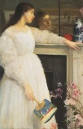
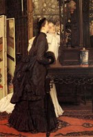
Japanese and Chinese objects functioned for Whistler as exemplars of his ideal of an art distinguished by visual qualities that only viewers gifted with "artistic" or aesthetically sensitive vision could perceive.[26] The artist's preoccupation with the special qualities of aesthetic vision structures the composition of his Symphony in White, No. 2: The Little White Girl (1864; fig. 3), in which a young woman garbed in white, her face reflected in a mirror above a fireplace, trains her dreamy gaze on a blue-and-white porcelain vase that sits next to a red lacquer covered bowl. The woman holds a Japanese fan in her right hand, while her left arm drapes along the mantelpiece in such a way that her wrist leans against the lacquer bowl while her fingers languidly touch the porcelain vase. While the woman's gazing profile suggests the tranquility of aesthetic contemplation, her apparent physical contact with the bowl and the vase hint at a more sensuous connection to the smooth surfaces of these treasured material possessions. The painting presents an image of the young woman's aesthetic appreciation of Asian objects that is complicated both by the sensuous intimacy of her hand's tactile connection to the objects and by the more emotionally charged aspect of her mirrored visage. In contrast to the serenity of the woman's pale, clearly articulated profile that tilts toward the vase, her face as reflected in the mirror is more heavily shadowed and bears a wistful or melancholy expression. The face of this shadowy doppelgänger in the mirror hints at deeper meanings lying beneath the smooth, reflective surfaces represented in the painting, whether those of mirror, lacquer, or porcelain.[27] Suggestions of underlying emotional complexity here overlap with evocations of exotic enigma in the interaction of the "white girl," or Caucasian woman, with the "china" and "japan" situated in the heart of British domestic space, just above the hearth. Moreover, the importance of imported objects as a generative source for British fantasies of an East Asia rendered almost imaginary by distance is directly encapsulated in the English language itself: just as the term "china" refers to porcelain, so too in the nineteenth century the word "japan" was used to mean "lacquer." Such linguistic usage turns a material object into a metonym for an entire nation and culture, suggesting how the tangible presence of Asian objects in Victorian homes could spark imaginative visions of otherness.
Through its play with blurring the boundaries between the actual and the virtual, familiarity and strangeness, presence and absence, embodiment and disembodiment, and intimacy and distance, the design of TheLittle White Girl represents the experience of aesthetic contemplation as internally charged with dynamic tensions. For example, the dialectic of sense and intellect that characterizes aesthetic experience is registered visually in this painting by the dark vertical bar that divides the otherwise seamless unity of the mirror above the mantel.[28] This narrow vertical band separates the top third of the composition into two sections that may be taken metaphorically to refer to the dualities of aesthetic experience: the realm of vision and intellectual detachment at the left, and the domain of touch and sensuous connection at the right, where the woman's hand grazes the Asian objects and a spray of pink azalea projects from the picture's edge in front of the Chinese vase, layering the flower's olfactory evocation of perfume on top of the vase's smooth surface.
The Uncanny Exotic
Whistler's concern with the evocative power of the aesthetic, and with the distinction between aesthetic vision and ordinary vision, runs throughout his visual and his verbal productions.[29] Reacting against a prevailing tendency in Victorian culture to focus on a painting's subject matter while slighting its aesthetic properties, Whistler rhetorically positioned the visual elements of art in opposition to the didactic and narrative in order to champion the preeminence of the visual alone. Whistler's verbal skirmishes with the public in the cause of "pure" art as against other "clap-trap" increased after the 1860s, and many of his textual sallies on behalf of art's autonomy are collected in his book The Gentle Art of Making Enemies.[30] In his "Ten O'Clock" lecture, first delivered in London in 1885 and subsequently included in The Gentle Art, Whistler described the downfall of true Art as follows:
Humanity takes the place of Art…Beauty is confounded with virtue, and, before a work of Art, it is asked: "What good shall it do?"…and thus the people have acquired the habit of looking, as who should say, not at a picture, but through it, at some human fact, that shall, or shall not, from a social point of view, better their mental or moral state [31]

In this passage, Whistler associates "Humanity" with a socially-minded approach to a picture that evaluates it as if providing transparent access to an intellectually or morally elevating "human" narrative. The artist's italics emphasize that people who look through and past the surface of a painting in search of a "human fact" neglect to look at the painting itself. An opposition between "Art" and the "human" also informs other statements by Whistler that belittle subject matter and narrative in painting while elevating the abstract visual qualities that he deemed properly to comprise true "Art." In his text "The Red Rag," Whistler set up two contrasting modes of how a viewer might respond to his painting "Harmony in Grey and Gold," later retitled Nocturne in Grey and Gold: Chelsea Snow (1876; fig. 4). The artist described an inappropriate interpretation of the slight, dark figure in his painting as a character from Dickens's The Chimes,[32] when it ought instead to be understood as "the black … wanted at that spot."[33] Implicit in this passage is a critique not just of narrative interpretation but even of representational interpretation; Whistler's words indicate that the thinly painted black shape on his canvas carries significance less as the depiction of a human figure than as the particular patch of color necessitated there by the visual organization of the painting.
While Whistler's later public rhetorical campaign to locate the value of a painting in its aesthetic properties rather than in edifying or entertaining "human" subject matter had not yet fully emerged in the 1860s, his prioritization of the purely visual elements of a painting had already surfaced in that decade in passages of his private correspondence. In a letter to Fantin-Latour in 1868, Whistler articulated his primary commitment to painting as an organization of colors on canvas through direct reference to "the Japanese":
It seems to me first of all that, with the canvas as given, the colours should be so to speak embroidered on it - in other words the same colour reappearing continually here and there like the same thread in an embroidery and so on with the others more or less according to their importance - the whole forming in this way an harmonious pattern - Look how the Japanese understand this![34]
Whistler's description of a successful painting as "first of all…an harmonious pattern" expresses his predominant concern with painting's decorative qualities; also significant here is his use of embroidery as an extended metaphor for a painting's design. Taken together, his references to "the Japanese" and to embroidery point toward Whistler's fascination with the embroidered designs on Japanese kimonos in this phase of developing a version of modern painting that would prioritize its own formal elements.[35] The admiration for "harmonious pattern" that Whistler voiced in 1868 could already be seen three years earlier in the profusion of decorated surfaces that fill La Princesse du pays de la porcelaine, as well as in the overall construction of the painting itself as a decorative surface. Whereas a portrait would traditionally concentrate expressive power in the sitter's face, Whistler's La Princesse instead presents its entire pictorial surface as an expressively decorative whole, allowing color to communicate more dramatically than the features of Christina Spartali's quietly composed face. Thus, for instance, Spartali's red mouth is rendered as one of many red blossoms scattered over the surface of the painting, this scarlet punctuation pulling together screen, fan, kimono, and face from disparate registers in spatial depth and in importance into the dynamically charged unity of the picture plane.
In the 1860s, Whistler's radical preoccupation with the decorative or formal components of art ran the risk of producing paintings that would be seen as merely sensuous; it may have been in response to this risk that East Asian objects proved so useful, or inspirational, to Whistler. Japanese and Chinese objects could provide a model for Whistler of an art with compelling vitality as pure form, due not only to such objects' visual novelty, but also to their enigmatic and uncanny aspects for Victorian viewers. In order to establish itself as more than "mere" decoration, Whistler's painting could draw upon the suggestiveness of the exotic, conflating the exotic's frisson of mysterious alterity with the ineffability of the aesthetic. Visual signs of "Japan" and "China" might then suggest the doubleness of the effect of the aesthetic, its extra-ordinary and non-linguistic meaningfulness as well as its sensuous appeal. The exotic object's capacity to signify the geographical remoteness and cultural difference of Japan or China could serve to distance and to complicate the immediate sensuous appeal of vivid color, compelling designs, and refined materials.[36] Following the model of exotic objects, Whistler's paintings might convey an almost magically different quality of sensation and significance through the visual itself.
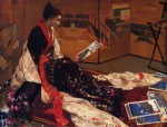
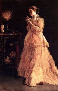
As the enchanting surfaces of East Asian objects could transport the Western viewer into exotic fantasies of distant lands with unfamiliar systems of thought and feeling, so might the formalist painting, when effective, transport the viewer to the rarefied realm of aesthetic contemplation. Whistler's Caprice in Purple and Gold: The Golden Screen (fig. 5), completed in 1864 and exhibited at the Royal Academy in London in 1865, suggests such an analogy between aesthetic contemplation and visions of the exotic. This canvas features the same model who appears in The Little White Girl, Joanna Hiffernan, here costumed in a plum-colored kimono and gazing at a print by Hiroshige while others lie scattered on the floor before her.[37] Although depicted with the loose facture and simplified modeling found throughout the image, the representation of the woman's face effectively expresses an intense absorption in the print that she holds.[38] That print, like those spread out on the carpet, is simplified within Whistler's painting into a pattern of vivid colors, as if Hiroshige's landscape image had been reduced to its aesthetic essence as an abstract composition of colors. Gazing at the abstracted image in her hand, the woman's profile is set against a multi-paneled Japanese screen on which paintings of human figures in architectural settings emerge from expanses of opaque golden clouds. At a descriptive level, this field of images behind Hiffernan's head pictures a folding screen that resembles screens of the Tosa school that represent literary subjects, such as scenes from The Tale of Genji, emerging from cloud formations of gold leaf.[39] In a more evocative mode, the images on the screen further suggest an expansion of the costumed woman's imaginative visions of Asia as she gazes at the print. Whistler's painting is composed so that one section of the golden clouds on the screen align neatly with the hairline on the young woman's forehead, a compositional intersection that associates the gold cloud with her mind's transport while enthralled by the aesthetic qualities of a Japanese print.
The Golden Screen, by blurring the distinction between the space of the studio in which Whistler's model poses and the spaces represented on the Japanese screen, further suggests the seated woman's mental transport to a realm in which the exotic and the aesthetic commingle, as if Hiffernan's intensity of aesthetic and imaginative absorption could dissolve physical boundaries. For while the panels of the gold screen tilt at clearly defined angles at the center and right side of Whistler's painting, at the left side of the image, behind the woman's head, the positioning of the panels is unclear and the gold-infused spaces pictured on the screen dissolve into the space of the room where the woman sits and looks. The painted indicators of spatial definition are scrambled at the left side of the painting, effecting an erosion of the distinction between actual and virtual space, whether the virtual space of the imagination or of the exotic image on the screen: while the dark strip that frames the bottom edge of the screen at the left edge of Whistler's canvas tilts at a steep angle as it rises behind the flowers emerging from the porcelain vase, the distinct brushstrokes that articulate the two small figures on this screen panel appear to ride on the surface of the canvas, in contradiction of the implied angle of the panel; furthermore, the shifting tonalities of yellow paint representing the gilded panels at left only serve to confuse, rather than clarify, the legibility of the space behind the woman. The pictorial means of color, value, design, and perspective that could define a consistent illusion of space instead here hover at the edge of dissolution into colors and shapes repeating across the surface of the painting "like the same thread in an embroidery," as the artist would write. So, for example, the shapes of the scalloped edges of the golden clouds are echoed by the curling lines of the vegetal tendrils in the embroidery on the pale silken robe that fans out along the floor for maximum visibility. These curving shapes intensify at the left side of the painting, where they appear as abstract embroidered designs on the robe, as the rounded touches of paint that make up the pink flowers, and in a dark squiggle that suggests a rock formation painted on the screen, just at the edge of the canvas. In such marks as this wriggling line of pigment, the painting on the tilted panel of the Japanese screen and Whistler's painting on his flat wooden panel become one.[40]
The simplification of the Hiroshige print positioned at the center of The Golden Screen, such that the other elements of the composition radiate outwards from it, may be related to the tendency of early Japonistes to be struck by the flat patches of color characteristic of such woodblock prints.[41] In his verbal response to effects of color unmodulated by tone in Japanese creations, Whistler admired the bold power of "pure" color as exemplified by "the Japanese" in the same letter of 1868 to Fantin-Latour that praised the Japanese understanding of "harmonious pattern." Rhapsodizing over two flower paintings by Fantin, Whistler marvels at the expressive force of color in these canvases; his impassioned remarks climax in exclamation over the paintings' unmodulated color as "like the Japanese":
An amazing burst of colour! - amazing is the right word - for although I always expect, when being shown new works by you, to see the freshness and colours that are especially your own, this time I was more surprised than ever by the brilliance and the purity of these flowers! - The effect in my studio is staggering - and I feel you have found something new, in the boldness of your colours which strikes me as enormous progress - you know what I mean - it's no longer a question at all of being well-painted - nor what they call 'tone' - but the colours of the flowers are taken absolutely from nature and placed on the canvas, just as, pure and raw - really - like the Japanese, good Lord![42]
Whistler's delight here in the "amazing" colors that are "pure and raw—really—like the Japanese" expresses a response to the qualities of East Asian objects already evident in the design of his Asian-themed paintings of 1864–65, in which the force of brightly colored pigment takes on an expressive autonomy of its own to compete with the expressive presence of the female figure.
Whistler's fervent response to the power of color in Japanese art is an individual manifestation of a broader predisposition among a growing number of European and American viewers to respond to the purely visual aspects of Chinese and Japanese objects. East Asian objects drew the attention of nineteenth-century viewers to their formal properties for a number of reasons. Victorian writers on Japan often made the point that the Japanese valued the decorative arts as much as the fine arts, which would suggest to their readers that decorative qualities carried a higher significance in Japanese objects than in Western ones. Furthermore, most Western viewers in the 1860s would necessarily approach Asian objects as primarily formal entities due to their lack of knowledge about East Asian cultures, literature, and history, which would prevent them from interpreting any represented scene on an Asian object as the illustration of a familiar story or moral, although they could speculate about potential unspecified narratives.[43] Attention to the formal qualities of East Asian objects was also promoted by the visual properties of the objects themselves: the striking difference of East Asian representational conventions for Victorian eyes—a lightened palette, strange color combinations, reduced or absent modeling, balanced asymmetries, and unfamiliar systems of spatial construction, for example—made representation apparent as a formal construction, thus heightening the viewer's awareness of art as visual form rather than mimetic depiction. The sheer visual novelty of the designs on Japanese and Chinese objects might startle or intrigue and, thus, lead the French or British viewer to a heightened awareness of those designs' formal components of color, line, shape, and composition, even while the sumptuous materials of silk, lacquer, gilded screens, and porcelain drew attention to the material splendor of those objects.
At the same time, in London in the 1860s, when the remoteness and cultural alterity of Japan and China could stimulate fantasies of an enchantingly otherworldly realm, East Asian objects could convey a sense that color and decorative form radiated a lifelike quality of their own. A variety of literary sources reveal a nineteenth-century penchant for perceiving Japanese and Chinese objects as charged with uncanny animation, as writers imagined the designs on East Asian objects coming to life. For example, Gilbert and Sullivan's popular operetta The Mikado (1885) begins with an insinuation that the figures decorating Japanese objects have come to life, as the chorus sings these opening lines: "If you want to know who we are, We are gentlemen of Japan; On many a vase and jar—On many a screen and fan."[44] The later Victorian sense of Japanese decorative objects as more real than any actual Japanese people emerges in Oscar Wilde's "The Decay of Lying" (1889), which refers to a British artist who visits Japan and finds it populated only with fans and lanterns: "One of our most charming painters went recently to the Land of the Chrysanthemum in the foolish hope of seeing the Japanese. All he saw, all he had the chance of painting, were a few lanterns and some fans…He did not know that the Japanese people are, as I have said, simply a mode of style, an exquisite fancy of art."[45] In earlier decades, a number of magazine stories and theatrical performances in London had popularized various versions of a fairytale-like story of a Chinese mandarin's daughter and her doomed love, from which the Blue Willow porcelain pattern, widely popular in Britain, supposedly derived.[46] That this "Chinese" pattern was itself an English invention, and the story actually a fantastic projection after the porcelain, gives a sense both of how chinoiserie and Japonisme referred to Western fantasies rather than to Asia itself, and of how such fantasies were often sparked by response to the visual appeal and physical presence of material objects. Indeed, a theatrical production entitled The Mandarin's Daughter! Being the Simple Story of the Willow-Pattern Plate, first performed at the Strand Theatre in 1851, framed its entire narrative as the unfolding of events depicted on a Blue Willow china plate: the opening stage directions specify that "The Drop Scene is painted to represent a Plate of the Willow Pattern."[47] Standing before this backdrop resembling an enormous Blue Willow plate, the character Chim-Pan-See initiates the drama by uttering lines in which he claims that he will magically bring the porcelain plate to life: "I am conjuror, wizard, magician, black doctor, / Of spells and love potions a potent concoctor. / I can make a stone sing, can put life in a slate, / As you'll see that I'll presently do to that plate."[48] Subsequent references in this theatrical extravaganza further develop the fanciful notion that the "Chinese" characters decorating a porcelain plate have been brought to life on the London stage.[49]
Although in Victorian literature and theatrical performances the conceit that the designs on East Asian objects had come to life functioned as diversion or amusement, the stimulus for such entertaining fancies may be traced back to the allure of the Chinese and Japanese objects that ornamented the homes of increasing numbers of British, European, and American consumers in the later nineteenth century. A sense that the Asian objects collected for their curiosity and aesthetic value possessed a mysterious life of their own may in part have involved the intense passion that a collector often develops for the objects in his or her collection. Walter Benjamin, for example, has described the intensity of connection between a collector and his possessions as dissolving the distinction between subject and object: "For inside him there are spirits, or at least little genii, which have seen to it that for a collector—and I mean a real collector, a collector as he ought to be—ownership is the most intimate relationship that one can have to objects."[50] Edmond de Goncourt, who figured among the early collectors of Japanese art in Paris in the 1860s, described the collector's intense passion for the objects in his collection as a new development in response to the stresses of modernity—"the dreariness of the present day" and "the labours of giving birth to a premature new society."[51] According to Goncourt, the nineteenth-century passion for collecting that arose from the desire "to forget the present moment in aesthetic satiety" further involved "a completely new emotion, namely the nearly human affection for objects."[52] Yet it is not simply in their position as objects within a collection but further in their particularity as exotic objects from intriguingly remote and alien lands that porcelain, fans, painted screens and other material objects from Japan and China could assume an uncanny sentience in the eyes of their owners.
East Asian objects symbolized unbridgeable cultural alterity and thus haunting enigma for Western viewers, yet these foreign objects also were collectible material things that were seen, touched, and lived with in the intimacy of British, European, and American homes. With their colorful surfaces fully on display even while their meanings in their Asian cultures of origin were unknown and thus hidden to the Western collector, the East Asian objects that decorated so many Victorian parlors embodied the dialectics of strangeness and familiarity, and of revelation and hiding, that Freud described in 1919 as characterizing the uncanny ("das Unheimliche"). According to Freud's theorization, one type of situation in which the uncanny arises involves an adult's experience in the present that resonates with his or her past infantile belief in animism, a belief that has been surmounted in the process of maturation but now resurfaces due to this experience. One of the powerful instances of the uncanny involves the perception that an inanimate object has come to life, as in Freud's example of a story about crocodiles carved on a wooden table that come alive at night. Freud writes that "an uncanny effect often arises when the boundary between fantasy and reality is blurred, when we are faced with the reality of something that we have until now considered imaginary, when a symbol takes on the full function and significance of what it symbolizes."[53] Such blurring of the distinction between fantasy and reality could be triggered by the Western viewer's contemplation of a Japanese fan or a Chinese vase, as the Asian object in its undeniably present tangibility prompted the commingling of fantastic visions of strange cultures and peoples with the reality of the material thing grasped in one's hand.

Paintings from the 1860s by Alfred Stevens and James Tissot, both friendly with Whistler in this decade and beyond,[54] depict European women whose enthralled gazes directed at East Asian objects seem to invest those objects with uncanny vitality. In 1869, Tissot painted three variations on the theme of Jeunes femmes regardant des objets japonais (figs. 6 and 7); though varied in their particular details, all three paintings represent young women in sumptuously appointed interiors who are transfixed by the allure of East Asian objects. Bending near to the object that holds their gazes, these women seem locked in an intimate involvement, as if the appreciation of Japanese art involved an emotional exchange with the object. The Japanese objects in these paintings—a ship's model, a figurine, a painted screen—seem to function as sentient characters in the pictorial drama together with their entranced beholders. In 1869 the critic Frédéric Borgella asked whether one of these pictures should be called Young Women Looking at Japanese Objects or instead Japanese Objects Looking at Young Women,[55] a remark that speaks to the painting's suggestion that the East Asian objects have a mysterious life of their own. In their capacity to engage the subjectivities of the women, the objects seem imbued with subjectivity themselves.[56] Painted just a year after Whistler's Princess, Stevens's La Dame en rose (1866; fig. 8) depicts an intimate moment between a fashionably dressed Caucasian woman and a Japanese doll. The doll's tiny face peers back up at the woman who gazes down in rapt absorption as she cradles its miniature body in her hands. The exotic doll, although miniscule, assumes a subjective presence to match that of the living woman in pink.
Other nineteenth-century images that suggest the animation of East Asian objects commingle the mystification of the exotic with an implicitly condescending tone of whimsy or humor. Paying Her Respects to His High Mightiness (fig. 9), an undated painting by the Italian artist Tito Conti (1842–1924) that the English collector Thomas Holloway acquired in 1883, depicts a European woman in seventeenth-century costume holding an East Asian fan and smiling playfully, while curtsying to a small statuette of a Chinese mandarin as if it were a living potentate.[57] At the same time that the woman's smile adds a self-consciously ironic overtone to her obeisance, the painting's highly detailed rendering of the sumptuous materials and exotic ornaments that fill the room—including a Chinese porcelain vase visually adjacent to the statuette—may undercut that irony through its visual expression of the fascination exerted by imported luxury commodities over Western viewers, whether the fictive seventeenth-century woman depicted in the painting or the Victorian collector of East Asian objects, oil paintings, and other art-commodities. Conti's painting thus confounds the distinction between living woman and exotic object in such a way as to suggest the characteristics of commodity fetishism in Marx's famous description,[58] as well as the Freudian uncanny. One might also see the paintings by Tissot and Stevens discussed above as conflating the uncanny animation of the exotic object with the mystical animation of fetishized commodities in nineteenth-century capitalist societies. Because the Japanese and Chinese objects that Whistler and his Japanist associates esteemed as high art in the 1860s were presented and made available through the commercial contexts of international exhibitions and curio shops, rather than in art museums, these exotic objects might serve especially vividly in figuring the tenuous distinction between art and commodity.[59]
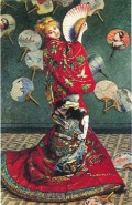
As the artistic and cultural trend of Japonisme grew more widely popular in France following the inclusion of Japanese objects in the Paris Exposition Universelle of 1867, the uncanny confusion of inanimate object and living being recurs as a motif in prints and paintings by French artists enamored with Japanese objects. For example, the card that was printed about 1867 for members of the Japoniste Jing-lar Society[60] (fig. 10) represents two origami birds hovering in the air, imbuing these folded-paper creations with an uncanny ability to fly. While the faceless origami birds seem to come alive, the figures of a Japanese man and woman below appear toylike in their diminutive size. To more dramatic effect on a large canvas, Monet's La Japonaise (1876; fig. 11) portrays his wife in a blond wig and a lavishly embroidered Japanese theatrical robe, standing before a wall decorated with East Asian fans. Mme Monet turns her head to look out over her shoulder, so that her blond head contrasts with the head of the Japanese figure that decorates her red robe. The embroidered male figure, though presenting a face that is more caricature than realistic physiognomy, appears as if brought to life through the vigor of his pose, the energy of his gaze, and the suggestion of relief in the rendering of his head and arms.[61] Another element of uncanny animation may be found in the Japanese fan on the wall decorated with the head of a woman who turns to her right, as if aware of and looking toward Camille Monet; the turn of the Japanese woman's head on the fan both suggests her animation, and collapses the distinction between the space of the room and the decorative realm of the fan.
Such confounding of spatial boundaries between life and art also occurs in Henry Somm's etching Japonisme (1881; fig. 12), in which two miniature Japanese men appear to emerge from a portfolio of prints: one holds up a tiny porcelain teacup, while the other carries a lantern and brandishes an opened fan, as if reaching across to the French woman at the center of the image.[62] The much larger scale of the woman's half-length figure, as well as the intense shadow that facilitates an illogical spatial transition between her head and the evocation of an architectural setting behind the men, suggests that the Japanese men are products of her imaginative reverie. As the fan overlapping the woman's shoulder bridges the gap between her fashionably bonneted figure and the miniaturized men, the print's composition supports the idea that such imaginative visions were prompted by the presence of the Japanese fans, lanterns, teacups, and other objects increasingly available in Europe. Moreover, the toy-like scale of the two Japanese men confuses the distinction between dolls and people, which involves both the uncanny animation of exotic toys for Western viewers and also the dehumanization, or sub-humanization, of Asian people that recurs as a racist trope in many nineteenth-century Western texts. Such doll-like Japanese figures also appear in Henri-Charles Guérard's etching from 1883, Calendar, 1884 (fig. 13), an image in which a profusion of miniaturized Japanese figures scamper about like animated dolls, or like mischievous animals: the tiny Asian men or boys along the top of the folding screen visually rhyme with the birds perched atop adjacent panels, and the posture of the little man seated at the foot of the screen echoes that of a monkey squatting nearby. As in Somm's etching, Guérard's Calendar places a fashionably attired French woman near the center of the image and mediates the visual transition between the European woman and the fantasized spaces of the "Japanese" through an outstretched fan. In addition to fans, folding screen, paper lanterns, a parasol, and the doll-like figures, Guérard's etching also includes a Japanese couple at the right side of the image, where interior space irrationally transforms into an exterior setting as rain slants across suspended paper lanterns and the floor dissolves into a body of water; in this fantastic space, a woman and man that resemble figures in Japanese prints appear as if energized and enlarged to a living state.
While the enlivening of doll-like Japanese figures in Guérard's Calendar and Somm's Japonisme may strike viewers as comic, other Japanese-themed prints by these artists include dolls and masks that appear more fully uncanny in their eerie animation. Guérard's series of etched Franco-Japanese Menus[63] (fig. 14) from the mid-1880s feature figures of disquietingly disparate scales interacting in hauntingly empty spaces: dancing skeletons, staring dolls, a looming Japanese mask, clothed Europeans, nearly naked Japanese men, a huge spider, paper lanterns, and a full moon.[64] The mask and the doll are inherently uncanny objects in their simulation of the outward features and facial expressions of living humans; both dolls and masks were popular items among Japanist collectors.[65] John Ruskin, who deemed the growing interest in Japanese art among British painters "very harmful," wrote little about Japanese art, but did express a vivid response to the Japanese masks that he saw at a performance by "Japanese jugglers" in London.[66] For Ruskin, Japanese masks possessed an especially uncanny quality; he wrote that "English masks are only stupidly and loathsomely ugly," whereas "the Japanese masks (like the frequent monsters of Japanese art) were inventively frightful, like fearful dreams."[67]
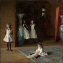
A well-known painting that features the uncanniness of East Asian porcelain in particular is The Daughters of Edward Darley Boit (1882; fig. 15) by John Singer Sargent,[68] like Whistler an American expatriate artist who lived in Paris and then London. Several recent scholars have noted that the painting's composition sets up a visual equation between the Boit daughers and the two enormous blue-and-white porcelain vases with which they pose:[69] on the one hand, the girls become like treasured objects; on the other, the Japanese vases take on a lifelike aspect due to their scale and the play of light on their lustrous surfaces, a shimmer suggestive of the mobility of life in its mutability dependent on angle of vision. Henry James's remarks on Sargent's picture comment on the equivalent presences of the girls and the looming Japanese vases: "Two of the sisters stand hand in hand at the back, in the delightful, the almost equal, company of a pair of immensely tall emblazoned jars, which overtop them and seem also to partake of the life of the picture; the splendid porcelain and the aprons of the children shine together."[70] The vivification of the Asian vases takes on a particularly uncanny quality due to the objects' placement within the pictorial composition. The vase at left—against which the oldest girl leans—gleams just on the threshold of a mysteriously shadowy interior room, evocative of family secrets, set behind the illuminated space of the picture's foreground. This vase's liminal position at the threshold between obscurity and illumination resonates with Friedrich von Schelling's definition of the uncanny, quoted by Freud as "something that should have remained hidden and has come into the open."[71] The other vase at the right edge of the painting stands just behind a vermilion screen, which further emphasizes the dialectic of concealment and revelation characteristic of the uncanny.
Flesh/Color
As its title implies, La Princesse du pays de la porcelaine presents its female subject to the viewer in such a way as to suggest her emergence from the designs on an East Asian porcelain vessel. This canvas's deliberate defiance of Western pictorial conventions of modeling and perspective heightens its impact as an overall colored surface, such that its decorative pattern competes with the expressive presence of the portrait subject. An oddly confectionery palette—dominated by peachy pink, silvery gray, and white—most likely draws upon the distinctive hues of Chinese "famille rose" porcelain.[72] This light palette not only pushes the canvas toward Eastern rather than Western artistic traditions, but also toward evoking the brightly painted designs on such porcelain rather than the darker tones associated with oil portraits. Christina Spartali's contrived pose further evokes the transformation of her figure from a costumed portrait into the outright emulation of a decorative design on Asian porcelain: the young woman crooks her hands oddly at the wrists in a gesture that appears quaintly foreign, while she stands with her head inclined forward and torso leaning back from the waist, imitating the S-curve posture of the female figures on Chinese porcelain or in Japanese prints. The curious affectation of Spartali's pose offers a more extreme version of the stiffness perceived by a British critic in Whistler's Lange Leizen of the Six Marks (fig. 2) when that painting was shown at the Royal Academy in 1864. After observing that in the Lange Leizen "Mr. Whistler…affects the Chinese manner," this reviewer declares that the seated female figure dressed in a Chinese robe "looks as if she had just stepped out from a china bowl, so stiff is she in bearing, and so redolent of colour is her attire."[73] The still greater degree of unnatural affectation to Spartali's pose in La Princesse further draws out the conceit of the decorations on a porcelain bowl or vase brought to life.[74]
At the same time that pose, palette, and unmodulated color position the exotically garbed woman in a liminal state between living model and the design on a porcelain vessel, other aspects of the work assert its ambitions to stake a position within the Western tradition of portraits in oil. Although its title alludes to a princess from China ("the land of porcelain"), the painting depicts the likeness of Christina Spartali, a woman of Greek ancestry whose physiognomy was Mediterranean rather than East Asian.[75] Whistler's conception of this work as a portrait is further demonstrated by his decision to exhibit it with the subtitle Portrait de Miss S... in 1892 at the Society of Portrait Painters in London.[76] That the artist's contemporaries also viewed this curious work as a portrait is apparent from an article by Ford Madox Brown published in 1888; in his text, Brown identifies among the examples of Whistler's best works "a portrait of the Countess de Cahen in Japanese costume"[77]—a reference to La Princesse, using Spartali's married name.[78]
La Princesse du pays de la porcelaine manifests a split between the horizontal band along the top, above the folding screen, and the greater part of the painting that lies below that screen's edge. In a work so engaged with colorfully patterned surfaces, the model's head is nevertheless set against an atmospheric shadowy background, as if to hold human subjective interiority in the upper zone of the work in a productive tension with the exuberant exteriority of the decorative surfaces below. Below the top edge of the screen, the painting visually rhymes human and decorative elements together: the woman's hands blend into her kimono of an identical pink-toned flesh color; her arms are positioned to emphasize the angular joints of elbows and wrists, echoing the stiffly jointed, angled planes of the screen behind her; the fall of black hair down her back seems to continue into the flow of maroon-colored fabric that pools onto the floor. Such visual suturing of flesh and costume, body and screen, hair and fabric, contributes to the commingling of human figure and decorative object in the painting.
In contrast to, and set above, the riot of decorative colored surfaces, the figure's head is set against a thinly brushed and partially rubbed away stretch of gray paint that is curiously attenuated: this gray area must denote a wall, since we see two fans tacked onto it, yet its ethereal quality suggests diffuse atmosphere rather than a flat, solid plane. This insubstantiality is an effect of the working of the paint, handled quite differently here than in the rest of the picture. The strikingly diaphanous application of the gray paint in this area is the earliest occurrence in Whistler's oeuvre of what would come to be his mature facture, employed in nearly all his paintings on canvas after 1870.[79] Such paint handling is unusual in the extreme thinness of the paint layer, which appears almost absorbed into or vaporized from the visible support of the weave of the canvas. It is perhaps no coincidence that Whistler's mature painting mode makes its first appearance here around a person's head, suggesting the realm of thought, spirit, and interior subjectivity. In contrast, the rest of the painting, executed with denser and more visibly articulated strokes of paint, emphasizes colored surfaces, the body, and materiality. The contrast between the handling and effects of these two zones is reinforced by a marked inconsistency in the use of shadow within the work. A strong shadow casts the right side of Spartali's face in obscurity, perhaps lending a suggestion of mysterious interiority to an otherwise neutral head evincing no apparent emotional expression. Given the absence of cast shadows elsewhere in the painting, the shadow on Spartali's face likely has less to do with the angle of light in Whistler's studio than with the painting's exploration of the tension between sensuous surfaces and the inner life that distinguishes a human subject from an empty, inert object.
When La Princesse du pays de la porcelaine was shown at the 1865 Salon, it failed to gain much praise even from critics who had admired Whistler's White Girl when it was exhibited at the Salon des Refusés as La Dame blanche two years before. With only a few exceptions, critics were disappointed by La Princesse, their reactions ranging from bewilderment to open disparagement.[80] Critical responses to La Princesse in 1865 often focused on the problematic project of combining elements of Western oil painting with aspects of East Asian decorative objects, as well as on the related issue of the work's failure to present the persuasive representation of a living woman. Some critics described La Princesse as the design on a porcelain vase blown up large and applied to canvas, while others viewed La Princesse as an imitation of the paintings on a Chinese or Japanese screen.[81] Closely involved with critical reactions against this painting's unseemly conflation of conventions from divergent cultures and of different media was irritation or outrage at this hybrid project's blurring of the distinction between the surfaces of decorative objects and the physiognomy of a human subject, expected to express a sense of inner life. Yet while the majority of critics disparaged the work as an Asian pastiche that only treated the exterior surfaces of decorative objects, a few critical voices instead rhapsodized about the mysterious interiority of the orientalized female subject.
"He could have, it seems to me, animated his princess, given her breath and life; the land of porcelain is not the land of the Shades."[82] These remarks by Ernest Chesneau, lamenting Whistler's perceived failure to bring the "princess" to life, articulated a common critical response at the Salon of 1865 to Spartali's representation as being unacceptably lifeless, far exceeding the trancelike stasis of the White Girl that had charmed certain critics two years earlier. Paul Mantz decried the work as "a costume study, and not the representation of a living figure,"[83] while C. de Sault wrote, "La Princesse du pays de la porcelaine is not a princess from the land of princesses, nor even from the land of beautiful women; but the said princess is nothing except a pretext for studies of clothing, of carpets, of drapes and of screens, in the colors of the Orient."[84] Paul de Saint-Victor also disparaged the painting as devoid of any living human presence by describing the figure as a bamboo stalk in costume: "There is nobody under this long robe with a floral pattern; it is a mediocre head, planted on a clothed bamboo."[85] Louis Auvray directly linked the figure's lack of solidity and animation with the decorations on Asian porcelain, his exclamation communicating outrage that any Western artist would take a Chinese vase as a model for his painting: "But to enlarge a small porcelain painting, without modelling, without expression, without movement!"[86]
In contrast to the many French critics in 1865 who belittled Whistler's painting for a failure to imbue the figure with the inner life that distinguishes a person from an object, a few critics responded in almost opposite terms to the exotically garbed "princess": these writers described themselves as struck, even disturbed, by what they perceived as an uncanny, almost excessive interiority. Louis Gallet, for instance, described himself as arrested by the sphinxlike quality of La Princesse, as if the mysteries of the East ran as deep as Oedipal enigmas: "La Princesse du pays de la porcelaine astonishes and irritates me…this woman's head with thick hair, with lips red like blood, stops you in your tracks in the manner of the antique sphinx."[87] The perception of a haunting suggestion of inner mysteries may also lie behind Louis Leroy's objections to the work as "these 'abacadabra' excesses."[88] For Théophile Gautier, fils, who reacted to the work as both "charming" and troubling, Spartali's figure radiated a power to access the depths of the soul, here figured in the quality of her gaze: "do you not feel troubled face-to-face with this penetrating gaze which, from the antipodes, seeks to pierce your European soul?"[89]
One might attempt to explain French critics' tendency to see either excessive or deficient interiority in this painting as related to the contrast between the shadowy zone around the figure's head and the riot of brightly lit surfaces below, as if different critics reacted to different areas of the painting. Yet such an explanation would fail to do justice to what makes the work so distinctive, for this visual division is, it should be stressed, one that occurs within a painting which nevertheless coheres as a whole, both through the decorative unity of its surface and through the integrity of the represented human figure. At the same time that the picture seems to posit subjective interiority in opposition to decorative exteriority through the contrast between its upper and lower zones, the work's overall effect is to propose that such an opposition is false: color and form convey a vitality that merges with the expressive qualities of the human. By blurring the distinction between inanimate object and living human, the picture proposes the vitality of the visual itself. While the conceit of transforming the painted design of a female figure on a Chinese vase into the portrait of a living woman who posed in his studio serves as the ostensible theme of Whistler's La Princesse, my contention is that this canvas also effects a second level of artistic vivification: at this second level, not only do the figurative designs decorating a vase come to life but, with more far-reaching implications, color itself assumes an autonomous life and expressive power of its own.
The sense that this painting hovers between the decorative and the human is reinforced by its title when first exhibited in London at the International Exhibition of 1872: Variations in Flesh Colour, Grey and Blue—"The Princess";[90] on this occasion, Whistler modified his work's title to add color terms, a staple in his titles from 1867 onwards.[91] The word "Variations" provides the musical nomenclature that Whistler commonly combined with color terms to produce his synaesthetically styled titles; at the same time, the artist's employment of "Variations" here also suggests alterations or transformations among the specified colors of "flesh colour,"[92] gray, and blue. Whistler's conception of his art placed great emphasis on the significance of a work's title, and he often exhibited a given painting with slight variations in its title from place to place, even involving shifts in the colors named.[93] Though many recent publications refer to it as Rose and Silver: La Princesse du pays de la porcelaine, the picture was not exhibited as such until 1898, more than three decades after it was painted.[94] In 1872, Whistler's original color-title of Variations in Flesh Colour, Grey and Blue—"The Princess" could suggest an oscillation between warm human flesh and cold blue porcelain. While the hues of "flesh colour" and gray have a stronger visual presence in the painting, the color blue—appearing in more restricted quantities in the blue-and-white carpet and the blue porcelain vase truncated by the right edge of the canvas—carries additional weight through its conceptual as well as visual import. In London at the time, the term "blue" would as directly signify Chinese porcelain as "flesh colour" references the human body, for among Whistler and his British friends, china was often called "blue and white" or even simply "blue," as in "old blue."[95] The blue named in Whistler's title of 1872 thus signals the painting's theme of "the land of porcelain."
Taken together with the design of "The Princess" as portrait-decoration, the hues of "flesh colour" and "blue" specified in the title suggests a tension between the symbolic importance of the human body in Western academic painting, on the one hand, and the decorative surfaces of Chinese porcelain, on the other hand. This oscillation between the formal qualities of color and the physical medium, evoked by "blue," and the symbolic weight of the human body in nineteenth-century European painting, suggested by "flesh colour," can be seen to reveal Whistler's preoccupation not just with visual form itself but with what the purely visual might mean. The combination of references to flesh and to porcelain in this early title points toward the artist's contention that an exclusive focus on the aesthetic itself could rival the traditions of history painting and other genres of Western painting based on the representation of the human figure. Whistler's work thus defies the Victorian public's expectation that the represented human body would be a symbol of ideas and carrier of emotions; instead, color and the handling of the paint—the flesh of the painting itself—communicate meaning and feeling to the viewer of La Princesse du pays de la porcelaine. The representation of Spartali's body within the silk robes is deliberately corporeally unconvincing in order to set in relief the corporeality of the painting itself, which ranges from the solid brushwork of the kimono to the delicate effects of the design on the screen. The transformative quality of Whistler's painting lies not in the fleshiness or soulfulness of the female figure but more in the shock and the pleasure of experiencing the boldly painted visual arrangement.

Whistler's favoring of a certain shade of pink in many of his works, and his designation of that hue as "flesh colour," continued in paintings and pastels with "flesh colour" in the title throughout his career; he also titled his decoration of the gallery's interior for his 1884 solo exhibition at Dowdeswell's in London an "Arrangement in Flesh-Colour and Grey" after its color scheme. The term "flesh colour" suggests how for Whistler color itself—the aesthetic alone—could assume the importance of representations of the human body as a carrier of meaning in the traditions of Western painting. The analogy between human body and the painting's body evoked by the term "flesh colour" is especially vivid in the case of a painting produced by Whistler the year after he completed La Princesse, his Crepuscule in Flesh Colourand Green: Valparaiso (1866; fig. 16). In this work, Whistler primed the canvas with the eponymous "flesh colour," so that the fundamental integument of paint, below the image of ships on the sea, consists of the peachy pink skin of this initial layer of color.[96]
Whistler's color-title of Variations in Flesh Colour, Grey and Blue involves a combination of the effects of distance suggested by the colors grey and blue—the hues of hazy views toward faraway places—together with the haptic proximity and bodily intimacy evoked by the color pink in itself and further emphasized by the artist's use of the term "flesh colour."[97] This linkage of flesh-colored sensuous immediacy with grey and blue remoteness comprises a titular compound that in itself evokes a dialectic central to aesthetic experience. While aesthetic experience, as the etymology of the word "aesthetic" demonstrates, always begins in sensory perception, the idea of the aesthetic factors in a crucial element of contemplative distance, in order to produce what Immanuel Kant described as the disinterested quality of aesthetic judgments, or judgments of taste.[98] Whistler's titling of his painting as Variations in Flesh Colour, Grey and Blue thus speaks to the dialectic in aesthetic experience of bodily sense perception and detached contemplation; this title's evocation of both immediacy and remoteness further resonates with the complex relationship between the material proximity of Japanese and Chinese objects in later nineteenth-century British, European, and American homes and the mysterious cultural distance and difference signified by those imported objects.
The nineteenth-century Western mythologizing of "China" and "Japan" as lands of spiritualized mystery received perhaps its most elaborate textual elaboration in the English language in the writings of the European-born American Lafcadio Hearn. Although Hearn's story "The Tale of the Porcelain-God" was published in 1887, more than two decades after Whistler completed La Princesse du pays de la porcelaine or Variations in Flesh Colour, Grey and Blue, Hearn's story strikingly gives verbal expression to the uncanny confounding of the distinction between living human body and inanimate object that is central to the design and meaning of Whistler's painting. In Hearn's story, one of several tales that comprise his book Some Chinese Ghosts, a Chinese porcelain vase attains a perfection of surface quality as exquisite as human flesh and then becomes eerily imbued with life through the self-immolation of its creator, Pu, as an offering to "The Spirit of the Furnace." Fully a third of Hearn's text is comprised of his lavish descriptions of the gorgeous colors and exquisite surfaces of many varieties of Chinese porcelain. This lush ekphrasis climaxes with Hearn's description of a vase so perfect that its porcelain surface takes on living vitality:
Then was the vase shapen and reshapen, and touched and retouched by the hands of Pu, until its blandness seemed to live, until it appeared to quiver and to palpitate, as with vitality from within, as with the quiver of rounded muscle undulating beneath the integument. For the hues of life were upon it and infiltrated throughout its innermost substance, imitating the carnation of blood-bright tissue, and the reticulated purple of the veins; and over all was laid the envelope of sun-colored Pe-kia-ho, the lucid and glossy enamel, half diaphanous, even like the substance that it counterfeited,—the polished skin of a woman.[99]
Through his subsequent self-sacrifice and the resulting eerie transfer of life to his porcelain creation, the Chinese potter Pu thus fulfills the Emperor's command that he make "a vase having the tint and the aspect of living flesh, but—mark well our desire!—of flesh made to creep by the utterance of such words as poets utter,—flesh moved by an Idea, flesh horripilated by a Thought!"[100]
At the same time that Whistler's title of 1872, Variations in Flesh Colour, Grey and Blue—"The Princess," evokes the uncanny animation of East Asian objects for Victorian viewers, Whistler's original title of 1865, La Princesse du pays de la porcelaine, also plays with the tension between human subject and decorative object through its multiple connotations. Though the painting would not come to be housed in the Peacock Room, surrounded by blue and white porcelain and Whistler's decorations, until the later 1870s, the idea of a special realm of porcelain already existed in this curious title of 1865. Whistler's quaint phrase, "the land of porcelain," reinforces the viewer's sense that the aesthetic, like the exotic, hovers between material reality and imaginative transport. In its first, most literal sense, "the land of porcelain" is the actual country, China, that produced the porcelains so coveted by British devotees of "chinamania." In a second sense, "the land of porcelain" could be the landscape represented in stylized blue lines on the surfaces of such porcelain: this landscape's lack of conformity with traditional Western perspective gave it a sense for Western viewers of a fantastic and magical realm, unruled by the expected norms of spatial representation. In his essay "Old China" (1823), for example, Charles Lamb describes his attraction to "those little, lawless, azure-tinctured grotesques, that under the notion of men and women, float about, uncircumscribed by any element, in that world before perspective—a china tea-cup."[101]
A third sense of "the land of porcelain" brings out the implications of La Princesse du pays de la porcelaine for the development of Whistler's particular version of modern painting; this version would feature a sense of something beyond as much as of the thing itself, and would convey magical or alchemical transformation as well as integrity of means. The magical quality of the "land of porcelain" is reinforced by the title's nomination of the female figure as a "princess," a term suggestive of a character in a fairy tale.[102] In this third sense, the "land of porcelain" is the realm of alterity to which the object transports its viewer. This land is elsewhere and beyond, but it is also, paradoxically, no more than the plate or the bowl itself, confounding surface and depth. The realm of the aesthetic is both entirely beyond this world and also entirely of this world; it is both the mythic exotic and the imported surface from which we might eat and that will shatter if we drop it, a treasure threatened by its own status as a commodity. "The land of porcelain" conveys Whistler's sense of the art object both as an immediate, sensuous thing and also as comprising an alternate world with its own standards, feelings, and ideas.
In its blurring of art and life, and of the decorative and the human, La Princesse du pays de la porcelaine shows that the relation between "art" and "human" in Whistler's work is more complex than suggested by his rhetorical polarization of the two terms in his pronouncements of later decades. At the same time that his work displaced the traditional privileging of the representation of the human subject by prioritizing the visual itself, Whistler sought to demonstrate that visual form could affect the sensitive viewer with a force and complexity to rival or surpass the effects of the traditional narratives and humanist subjects of painting. In its capacity to move the thoughts and feelings of the aesthetically attuned human beholder, form would become "human."
While Whistler's writings about art do not explicitly elaborate on the emotional and intellectual force of the visual itself, the painter's commitment to the expressive power of color and form emerges from the ironic implications of barbed comments that he penned during a conflict with the poet Algernon Swinburne over the merits of Japanese art and the value of art's exclusively visual properties.[103] In a scathing review of Whistler's "Ten O'Clock" lecture—a review first published in 1888 and then subsequently edited by the artist and reprinted as "An Apostasy" in his Gentle Art[104]—Swinburne had condemned the painter's advocacy of Japanese objects as a model for the highest art. According to Swinburne, Japanese productions are devoid of the meaning and human expression that art should convey. Swinburne's disgust with what he calls "the fortuitous frippery of Fusi-yama [sic]" and "the limbo of blue china"[105] reverberates with anxiety about the potential destruction of traditional Western artistic modes of expressive significance; he claims that Japanese art is nothing but "harmonies in colour" empty of any further meaning or purpose: "Japanese art is not merely the incomparable achievement of certain harmonies in colour; it is the negation, the immolation, the annihilation of everything else."[106]
As articulated in his marginal "reflections" in The Gentle Art, Whistler's retaliation against Swinburne's remarks rests on his unwavering belief that visual form itself is meaningful in its effects on the viewer's thoughts and emotions. Printed in the margins adjacent to Swinburne's assertion that paintings "which actually appeal to the intelligence and the emotions, to the mind and heart of the spectator" have "explicitly violated and implicitly abjured the creed and the canons, the counsels and the catechism of Japan," Whistler voiced his defense of the "Japanese" and of the aesthetic. The artist first observes scornfully, "it would seem that, for the Bard, the lovely is not necessarily 'effective,'"[107] and then reflects, "The 'lovely,' therefore, confessedly does not appeal to the intelligence, emotions, mind and heart of the Bard even when aided by the 'effective.'"[108] These marginal rejoinders reveal that for Whistler an artwork's power (or "effectiveness") resides in its aesthetic properties (here termed "the lovely"); and that for Whistler a work's visual elements—its "loveliness" or beauty—surely reach the viewer's intelligence and emotions. For Whistler, the responses of the eye could not be separated from those of the mind and the heart; in this way, the "lovely" or beautiful is in itself "necessarily 'effective'" in communicating ideas and feelings to the viewer. Whistler's implied argument for the expressive power of the aesthetic in his editorial response to Swinburne in 1890 echoes his claim for the significance of color and form embodied in the design of La Princesse du pays de la porcelaine in 1865. In both instances, the artist deployed the example of Japanese and Chinese objects to buttress his claims for the autonomy and vitality of painting's visual elements.

Although the silk-clad "princess" is the apparent subject of La Princesse du pays de la porcelaine, ultimately the work's concern with the relation between visual form and pictorial meaning emerges as its more fundamental subject. This use of East Asian objects to propose that form is meaningful in its own right distinguishes Whistler's painting from other Japoniste pictures of his day, even while it shares with them a fascination with decorative surface and with the uncanniness of the exotic. Beyond its specific stylistic references to the visual properties of East Asian objects, Whistler's La Princesse further engages with a mythic vision of China/Japan—"the land of porcelain"—as a model for the reconceptualization of painting as significant apart from figurative subject matter. Yet at the heart of this strategy lay a contradiction: the reliance on exotic subject matter, paradoxically, to convey the idea that subject matter in a picture should not signify. This contradiction would necessitate a move toward pictorial abstraction for its resolution in Whistler's paintings after 1870, most notably in the twilight and evening landscapes that he called Nocturnes[109] (fig. 17). Although Whistler's Nocturnes present views of specific, identifiable places, their dematerialization of water, sky, land, and architectural elements renders this subject matter less tangible than the color on the panel or the canvas. In these later works, Whistler would no longer rely on the thrill of the exotic "Japanese" to signal the otherness and the mysterious effectiveness of the aesthetic, although the eerily transformative quality of night would add an edge of uncanniness to the expanses of color that constitute these nearly monochromatic paintings. The suggestive near-abstraction of Whistler's Nocturnes built on his investigation of the relationship between visual form and aesthetic experience, which he first dramatically presented to the public in the curious conception and striking execution of La Princesse du pays de la porcelaine at the Salon of 1865. Bringing together uncommon combinations of East and West, oil portrait and porcelain, "flesh colour" and blue, living and inanimate, Whistler's La Princesse du pays de la porcelaine marked a watershed in his artistic development by proposing that visual form itself could comprise the primary subject of a painting.
For their attentive reading and thoughtful suggestions in response to this text, I sincerely thank Elizabeth Mansfield, María DeGuzmán, Gregory Levine, Noriko Murai, Jeanne Nugent, Andrés Zervigón, and the anonymous readers for Nineteenth-Century Art Worldwide. This article grew from a chapter in my PhD dissertation, and I am grateful to Henri Zerner, Norman Bryson, and Eric Rosenberg for their guidance in my development of that earlier version of this material.
Translations are my own, unless otherwise indicated.
[1] While La Princesse du pays de la porcelaine has often been assigned the date of 1863–64, Linda Merrill presents persuasive evidence for dating the painting to 1864–5 in her scrupulously researched account of the work's genesis; see Linda Merrill, The Peacock Room: A Cultural Biography (Washington, DC: Freer Gallery of Art, 1998), 66–73. The date that Whistler inscribed on the canvas is 1864.
[2] A fifth painting fitting into this group of paintings of women in Asian costume, The Scarf, was exhibited at the Royal Academy in 1865; this work is lost. See Andrew McLaren Young and others, The Paintings of James McNeill Whistler (New Haven: Yale University Press, 1980), 33.
[3] A book and related article by Linda Merrill provide the most detailed existing studies of La Princesse du pays de la porcelaine: see Merrill, The Peacock Room, esp. chap. 1, and Merrill, "Whistler and the 'Lange Lijzen,'" Burlington Magazine 136, no. 1099 (October 1994): 683–90. Both Merrill's book chapter and her earlier article weave together valuable research and ideas about this painting's significance and the historical context of its production, from which the present article has benefited. Among other recent publications on Whistler's art, a discussion of La Princesse that focuses on the impact of Asian costume on Whistler's work can be found in Margaret F. MacDonald, "East and West: Sources and Influences" in Margaret F. MacDonald and others, Whistler, Women, and Fashion (New York: Frick Collection, 2003), 52–75.
[4] While scholars of French art tend to overlook Whistler's role in artistic developments in Paris in the 1860s, an important exception exists in Michael Fried's analysis of Whistler's works in his book Manet's Modernism,or, The Face of Painting in the 1860s (Chicago: University of Chicago Press, 1996).
[5] For the provenance and exhibition history of the painting, see Young and others, Paintings of James McNeill Whistler, 26–27. For information about the painting as related by Marie Spartali Stillman, Christina's sister, see E. R. Pennell and J. Pennell, The Life of James McNeill Whistler (Philadelphia: Lippincott,1908), 1:122–24. For further details on the history of the painting's production, see Merrill, Peacock Room, 66–75.
[6] Although Whistler's White Girl of 1862 plays with a similar prioritizing of color itself—in this case, whiteness—over subject matter and narrative, La Princesse du pays de la porcelaine comprises a more defiantly unmitigated promotion of the exclusively visual elements of painting. For further analysis of the significance of The White Girl, see Aileen Tsui, "The Phantasm of Aesthetic Autonomy in Whistler's Work: Titling The White Girl," Art History 29, no. 3 (June 2006): 444–75.
[7] Arthur Jerome Eddy, Recollections and Impressions of James A. McNeill Whistler (Philadelphia: J. B. Lippincott, 1904), 58.
[8] The present article employs the French title—La Princesse du pays de la porcelaine—with which Whistler first exhibited this canvas in Paris in 1865. He did not supplement this title with the names of colors until the work was exhibited in later years, and the color components of the title for this painting changed over time; the implications of Whistler's titling of La Princesse are discussed later in this article.
[9] In "Whistler and the 'Lange Lijzen,'" Linda Merrill has argued persuasively for the close association between porcelain and painting in Whistler's art. As Merrill notes, evidence for Whistler's "equation of easel paintings with porcelain paintings" (690) first appears in his painting The Lange Leizen of the Six Marks, of 1864, in which the supposed porcelain painter may be taken metaphorically to stand for the artist himself. My 2008 paper, "The Painter as Collector: Whistler's Japanism and the Abstracting Eye," puts forward further angles of interpretation of both Whistler's Lange Leizen and his Artist in His Studio of 1865; this paper, presented at the North American Victorian Studies Association conference (Yale University, November 2008), comprises part of an article currently in progress.
[10] In his review of the 1865 Salon, Théophile Thoré emphasized the insubstantiality of Whistler's "princess": "Princesse du pays des chimères, autant que du pays chinois, une apparition vague, impalpable, qui s'épanouirait sous le battement d'ailes d'un papillon." ("Princess from the land of chimeras, as much as from China, a vague, impalpable apparition, which would blossom under the beating of the wings of a butterfly.") Thoré, Salons de W. Bürger 1861 à 1868 (Paris: J. Renouard, 1870), 201.
[11] For biographical information on Whistler, see Ronald Anderson and Anne Koval, James McNeill Whistler: Beyond the Myth (New York: Carroll and Graf, 1994).
[12] See the following entries in Gabriel P. Weisberg and Yvonne M. L. Weisberg, Japonisme: An Annotated Bibliography (New York: Garland, 1990): C.Y. [Champfleury], "La Modes des japonaiseries," La Vie Parisienne (1868), at 144; Ernest Chesneau, "Le Japonisme dans les art," Musée Universel (1873), at 160; Philippe Burty, "Fine Art—Japonism," The Academy (1875), at 163.
[13] Linda Merrill has noted that connections between Whistler's art and Chinese porcelain, as distinct from Japanese prints, have often been overlooked by art historians; see Merrill, "Whistler and the 'Lange Lijzen,'" 687. For information about Whistler's activities as a collector of Chinese porcelain, see Merrill, The Peacock Room. For an analysis of Whistler's admiration for Chinese porcelain in the context of the nineteenth-century British fascination with china, see Elizabeth H. Chang, "'Eyes of the Proper Almond-Shape': Blue-and-White China in the British Imaginary, 1823–1883," Nineteenth Century Studies 19 (2005): 17–34.
[14] See Merrill, Peacock Room, 171. See also Christine M. E. Guth, Longfellow's Tattoos: Tourism, Collecting, and Japan (Seattle: University of Washington Press, 2004), 172.
[15] In a visual allusion that Linda Merrill has noted, the pose of the woman in Du Maurier's cartoon "The Six-Mark Tea-Pot," published in Punch (Oct. 30, 1880), clearly refers to Whistler's La Princesse, as Du Maurier's woman—entranced by a china teapot—similarly stands before an East Asian folding screen and a porcelain vase, her body and head tilting at similar angles, and the train of her skirt likewise gathering on the floor. See Merrill, Peacock Room, 51.
[16] On this higher esteem for Japanese than Chinese art and culture, see, for example, Michael Sullivan, The Meeting of Eastern and Western Art (Berkeley: University of California Press, 1989), 213; and Ting Chang, "Collecting Asia: Théodore Duret's Voyage en Asie and Henri Cernuschi's Museum," Oxford Art Journal 25, no. 1 (2002): 17–34.
[17] For example, in his "Ten O'Clock" lecture Whistler named blue "Nankin" porcelain, as well as "the fan of Hokusai," as exemplary of the greatest art from all times and places. See "Mr. Whistler's 'Ten O'Clock'" in James McNeill Whistler, The Gentle Art of Making Enemies (London: William Heinemann, 1890), 156, 159. The importance of blue-and-white Chinese porcelain as a model for Whistler's artistic aims is central to the composition of The Artist in His Studio (also known as Whistler in His Studio) of 1865-66, an oil study for a composition that the artist planned as his next submission to the Paris Salon after La Princesse. See Young and others, Paintings of James McNeill Whistler, cat. no. 63, 36–37.
[18] Anna M. Whistler to James H. Gamble, February 10–11, 1864, Glasgow University Library; as published in Margaret F. MacDonald, Patricia de Montfort, and Nigel Thorp, eds., The Correspondence of James McNeill Whistler, 1855–1903, On-line edition, University of Glasgow, http://www.whistler.arts.gla.ac.uk/correspondence [rec. no. 06522], (accessed September 5, 2009).
[19] Edward Said, Orientalism, (New York: Vintage, 1978). While Said's study focuses on verbal texts, his book has been followed by a rich body of scholarship that critically examines Orientalism in nineteenth-century art and visual culture; this extensive body of scholarship was initiated by Linda Nochlin's important article "The Imaginary Orient," Art in America 71 (May 1983): 118–31, 187–91.
[20] Unlike many other European and American artists in the later nineteenth century who collected both Middle Eastern and Far Eastern objects, Whistler's collecting activities and artistic interest in the East focused exclusively on the products of China and Japan.
[21] "Ici, je suis presque dans le Paradis. Nous faisons une vie impossible, tous les trois dans l'atelier de Whistler. On se croirait à Nangasaki [sic] ou dans le Palais d'Eté, la Chine, le Japon, c'est splendide." Fantin-Latour to his parents, July 12, 1864, as quoted in Robin Spencer, "Whistler and Japan: Work in Progress" in Japonisme in Art: An International Symposium, ed. Yamada Chisaburo (Tokyo: Kodansha International, 1980), 60. The third person Fantin refers to here is the artist Alphonse Legros.
[22] Among the many acute observations included in his study of "Whistler and Japan" (1980), Robin Spencer described Whistler's Japonisme as a vehicle for gaining public notice: "The new fashion for Japonisme was a way of keeping his name before the critics in Paris while he was living in London." See Spencer, "Whistler and Japan," 62.
[23] For an extremely thorough and helpful guide to the extensive range of publications on Japonisme, see Weisberg and Weisberg, Japonisme: An Annotated Bibliography. On Whistler's Japonisme, see the following publications: Spencer, "Whistler and Japan"; Toshio Watanabe, High Victorian Japonisme (Bern: Peter Lang, 1991); Klaus Berger, Japonisme in Western Painting from Whistler to Matisse, trans. David Britt (Cambridge: Cambridge University Press, 1992), 33–47; Ayako Ono, Japonisme in Britain: Whistler, Menpes, Henry, Hornel and Nineteenth-Century Japan (London: RoutledgeCurzon, 2003), chap. 2.
[24] J. Jackson Jarves, "A Genuine Artistic Race," Part I, Art Journal 33 (March 1–July 1, 1871): 77.
[25] Whistler's concern to distinguish the aesthetically sensitive vision of gifted viewers from the common vision of ordinary viewers preoccupied him throughout his career. For further discussion of this issue, see Tsui, "The Phantasm of Aesthetic Autonomy"; and see Robert Slifkin, "James Whistler as the Invisible Man: Anti-Aestheticism and Artistic Vision," Oxford Art Journal 29, no. 1 (2006): 53–75.
[26] Although Whistler most often referred to the special discernment of the gifted viewer as "artistic" vision, I employ the term "aesthetic vision" here for its more specific resonance with the Aestheticism of Whistler's artistic aims.
[27] Kathy Alexis Psomiades has described The Little White Girl in the following terms: "The complex psychological mysteries of its viewer, revealed by the mirror, freight the vase with meaning…If the girl is a psychological subject, the vase has become a psychological object." Psomiades, Beauty's Body: Femininity and Representation in British Aestheticism (Stanford: Stanford University Press, 1997), 108–9.
[28] This vertical bar may also be another sign of Whistler's Japanism, for the use of vertical posts or pillars to divide space is a notable feature of many Japanese prints and paintings, as discussed in the section "Posts as spatial dividers" in Siegfried Wichmann, Japonisme: The Japanese Influence on Western Art since 1858, trans. Mary Whittall and others (New York: Thames and Hudson, 1999), 251–57.
[29] As Elizabeth Prettejohn has discussed, Whistler appears to have worked out his "theory of art," such as it was, initially and primarily through his experiments as a painter in the years leading up to 1871, and then only subsequently in verbal form. Elizabeth Prettejohn, Art for Art's Sake: Aestheticism in Victorian Painting (New Haven and London: Yale University Press, 2007), 166–67.
[30] Whistler, Gentle Art. In the present article, all quotations from the Gentle Art derive from the first edition of 1890, as cited above in note 16; a second, expanded edition of the book was published in 1892.
[31] Whistler's italics. See "Mr. Whistler's 'Ten O'Clock'" in Whistler, Gentle Art, 137–38.
[32] The complete title of this short novel by Charles Dickens, published in 1844, is The Chimes: A Goblin Story of Some Bells that Rang an Old Year Out and a New Year In. In the context of the present study's attention to Whistler's play with the uncanniness of the exotic, it may be significant that the artist here chose to cite a novella that was not only popular, sentimental, and moralizing, but that also included the uncanny aspects of "a goblin story."
[33] "I care nothing for the past, present, or future of the black figure, placed there because the black was wanted at that spot. All that I know is that my combination of grey and gold is the basis of the picture." Whistler, "The Red Rag," in Gentle Art, 126. "The Red Rag" is Whistler's edited version of an interview that had been published in The World as "Celebrities at Home, No. XCII: Mr. James Whistler at Cheyne-walk" on May 22, 1878.
[34] "d'abord il me semble que la toile donnée, les couleurs doivent être pour ainsi dire brodées là dessus - c'est à dire la même couleur reparaitre continuellement ça et là comme le même fil dans une broderie - et ainsi avec les autres - plus ou moins selon leur importance - le tout formant de cette façon un patron harmonieux - Regardes les Japonais comme ils comprennent ça!" (Whistler's emphasis.) Whistler to Fantin-Latour, September 30, 1868, Pennell-Whistler Collection, PWC 1/33/28, Library of Congress; as translated and published in MacDonald, de Montfort, and Thorp, Correspondence of James McNeill Whistler, On-line edition, http://www.whistler.arts.gla.ac.uk/correspondence [rec. no. 11983], (accessed September 5, 2009). The editorial policy of the online edition of Whistler's correspondence is to retain the original spelling and punctuation of the documents transcribed, so errors in spelling and foreign accents are not corrected.
[35] As Margaret MacDonald has discussed, in the mid-1860s Whistler was vying with James Tissot and Dante Gabriel Rossetti to collect Japanese and Chinese robes sold in Paris, and these East Asian costumes played an important role in the development of his art in this period. See MacDonald, "East and West," 62–64.
[36] In his investigation of the socio-cultural motivations for the chinoiserie trend in eighteenth-century Britain, David L. Porter contends that the British viewer's awareness of cultural difference in response to objects perceived as exotic plays a central role in chinoiserie's modification of aesthetic experience. See David L. Porter, "Monstrous Beauty: Eighteenth-Century Fashion and the Aesthetics of the Chinese Taste," Eighteenth-Century Studies 35, no. 3 (2002), 405.
[37] Although Whistler represents these ukiyo-e prints in simplified form, enough specificity in the composition of colors exists for scholars to have identified them as images by Hiroshige, most likely from his series Sixty-odd Famous Places of Japan. See Spencer, "Whistler and Japan," 61–62.
[38] For Michael Fried, the woman's facial expression communicates a state "delicately poised between genuine interest in the print she holds in her hand and an awareness of sitting for the painter"; see Fried, Manet's Modernism, 227.
[39] See Young and others, Paintings of James McNeill Whistler, 34.
[40] Whistler's Caprice in Purple and Gold: The Golden Screen is painted on wood rather than on canvas.
[41] For example, in his essay first published as "A New Manner in Painting: Edouard Manet" in 1867, Emile Zola proposed a comparison between Manet's paintings and Japanese prints, praising Japanese prints for "their strange elegance and magnificent bold patches of colour"; Zola as translated and reprinted in Charles Harrison and Paul Wood, Art in Theory 1815–1900 (Oxford: Blackwell, 1998), 560.
[42] "c'est d'un éclat de couleur inattendu! - inattendu est bien le mot - car bien que je m'attends toujours à voir, lorsqu'il s'agit de me montrer de nouvelles toiles de toi, les fraicheurs et les belles couleurs qui tu [sic] sont particuliers, j'ai été cette fois ci plus surpris que jamais par le brillant et la pureté de ces bouquets! - L'effet dans mon atelier est étourdisant - et il me semble que tu as trouvé quelque chose de nouveau, dans la hardiesse de tes couleurs qui pour moi est énorme comme progres - tu comprends ce que je veux dire - ce n'est plus une affaire de bien peint du tout - ni ce que l'on appel 'ton' - mais les couleurs des fleurs sont pris sur nature cranement et posées sur la toile tel que, pures et crues - sans crainte - comme les Japonais ma foi!" Whistler to Fantin-Latour, September 30, 1868, in MacDonald, de Montfort, and Thorp, Correspondence of James McNeill Whistler, on-line edition.
[43] Quentin Bell has written of Victorian artists' encounter with Japanese as with "an art which represented transactions the nature of which could only be guessed at, the story of which was buried in the conventions of an alien culture, an art which therefore had to be accepted on purely aesthetic terms, an art which for its discoverers, was art for art's sake." Quentin Bell, Victorian Artists (Cambridge, MA: Harvard University Press, 1967), 72. See also Merrill, Peacock Room, 72, on William Michael Rossetti's commentary, published in 1863, on a book of prints by Hokusai: "Indecipherable subject matter compelled him [W. M. Rossetti] to regard the woodcuts as an artist would (and Whistler must have done), delighting in novel elements of style."
[44] William Schwenck Gilbert, The Mikado (1885; repr., New York: Dover, 1992), 1.
[45] Oscar Wilde, "The Decay of Lying" (1889) in Intentions (New York: Brentano's, 1905), 47.
[46] See Patricia O'Hara, "'The Willow Pattern That We Knew': The Victorian Literature of Blue Willow," Victorian Studies 36, no. 4 (Summer 1993): 421–42. In addition to analyzing Victorian magazine articles, fiction, and poetry that elaborated this putatively "Chinese" tale supposedly represented on Blue Willow china, O'Hara refers to two dramatic productions that included staged versions of the story: Francis Talfourd and W. P. Hale, The Mandarin's Daughter! Being the Simple Story of the Willow-Pattern Plate (London: T. H. Lacy, [1851?]), and F. C. Burnand's A Tale of Old China (1874).
[47] Talfourd and Hale, Mandarin's Daughter!, 4.
[48] Ibid. Later in his introductory remarks, this character again emphasizes that he will bring the scene on the Blue Willow plate to life: "And to-night all my powers of vivification / I'll employ on that plate." (5). The racism implicit in the naming of this Chinese magician as "Chim-Pan-See" is of course unmistakable.
[49] See, for example, Chim-Pan-See's later address to the audience concerning the mise-en-scène of the dramatic action: "And the scenery on the bank, which in the plate is left a blank, / Will be left entirely to the painting of your vivid imagination." Ibid., 17.
[50] Walter Benjamin, "Unpacking My Library" in Illuminations, ed. Hannah Arendt, trans. Harry Zohn (New York: Schocken, 1968), 67.
[51] "la tristesse des jours actuels"; "l'enfantement, les pieds devant, de la société nouvelle." Goncourt, from La Maison d'un Artiste(1881), as quoted and translated by Anita Brookner in The Genius of the Future: Essays in French Art Criticism (Ithaca: Cornell University Press, 1971), 142–43. While Brookner gives only the original publication date (1881) of Goncourt's book without a full citation, the French text that she quotes can be found in Edmond de Goncourt, La Maison d'un artiste (Paris: Bibliothèque-Charpentier, 1898), 1:3.
[52] "l'oubli du moment dans l'assouvissement artistique"; "un sentiment tout nouveau, la tendresse presque humaine pour les choses." Ibid.
[53] Sigmund Freud, "The Uncanny," in The Uncanny, trans. David McLintock (New York: Penguin, 2003), 150.
[54] For more specific information on Whistler's connections with Stevens and Tissot, see the catalogue entries on the latter two artists by Richard Dorment in From Realism to Symbolism: Whistler and His World (New York: Columbia University, 1971), 131 and 132. As Dorment notes, while Whistler was on friendly terms with both Stevens and Tissot in the 1860s, he was especially close to Tissot in the 1870s and to Stevens in the 1880s.
[55] Borgella wrote in Le Globe, June 4, 1869: "Jeunes Femmes regardant des objets japonais, ou des objets japonais regardant des jeunes femmes, c'est tout un: matière de chinoiserie!" As quoted in Michael J. Wentworth, "Tissot and Japonisme," in Japonisme in Art: An InternationalSymposium, 145, note 14.
[56] Although my interpretation here emphasizes the enlivening of the Japanese objects in Tissot's three versions of Jeunes femmes regardant des objets japonais, one may also see these paintings as effecting the objectification of the young women represented. For an analysis of the parallel between the women crouched over the ship's model and the Japanese puppets in the golden shrine behind them that is visually suggested by the painting currently in Cincinnati, see Nancy Rose Marshall's catalogue entry in Nancy Rose Marshall and Malcolm Warner, James Tissot: Victorian Life, Modern Love (New Haven: Yale University Press, 1999), 44.
[57] This historical costume picture from the Victorian period makes reference to the influx of Chinese goods to Britain following the foundation of the Dutch East India Company in the seventeenth century. See Mary Cowling, Paintings from the Reign of Victoria: The Royal Holloway Collection, London (Alexandria, VA.: Art Services International, 2008), 84.
[58] Karl Marx, "The fetishism of commodities and the secret thereof," in Capital: A Critique of Political Economy, ed. Frederick Engels, trans. Samuel Moore and Edward Aveling (New York: The Modern Library, 1906), 81–96. This first volume of Das Kapital was originally published in German in 1867.
[59] Although it is beyond the scope of this article's argument, the relationship of Whistler's Japanism to Aestheticism's concern with the tension between artwork and commodity is a significant topic, an analysis of which I am currently developing in a book project entitled Whistler's Gold.
[60] Whistler's close friend Henri Fantin-Latour was a member of the Société du Jing-lar.
[61] On Monet's La Japonaise, see David Bromfield and others, Monet and Japan (Canberra: National Gallery of Australia, 2001), 23–25.
[62] For an analysis of further details in this print, and for an interpretation of the image that emphasizes its parodic qualities, see Elizabeth K. Menon, "Henry Somm's Japonisme, 1881 in Context," Gazette des Beaux-Arts 119, no. 1477 (Feb. 1992): 89–98; and see Elizabeth K. Menon, "The Functional Print in Commercial Culture: Henry Somm's Women in the Marketplace," Nineteenth-Century Art Worldwide 4, no. 2 (Summer 2005): 1–16. The more recent article also reproduces and analyzes further prints by Somm that include representations of tiny, doll-like Japanese men.
[63] Guérard's Calendar and Franco-Japanese Menus, as well as several other prints by the same artist that also include uncannily animated Japanese objects, are included in Gabriel P. Weisberg, Japonisme: Japanese Influence on French Art 1854–1910, exh. cat. (Cleveland: Cleveland Museum of Art, 1975), 79–81.
[64] As noted in the catalogue entry in Weisberg, Japonisme, the composition of these images likely draws on the example of Hokusai's Manga. Ibid., 78.
[65] According to his biographers E. R. Pennell and J. Pennell, in the mid-1860s Whistler's house was "full of Japanese dolls." They further state: "One great doll, dressed like a man, he would take with him…to other houses, where he put it through amazing performances." Pennell and Pennell, Life of James McNeill Whistler, 1:109.
[66] John Ruskin, Time and Tide, by Weare and Tyne: Twenty-five Letters to a Working Man of Sunderland on the Laws of Work (London: George Allen and Unwin, 1867), 34–35.
[67] Ibid., 35.
[68] Writing about Sargent's talent on display in this painting and in Madame X (Mme. Pierre Gautreau), Henry James referred to the "'uncanny' spectacle" of the painter's early artistic mastery. Although James used the word "uncanny" to refer to Sargent's disquietingly precocious artistic abilities, one might wonder whether the atmosphere of The Daughters of Edward Boit affected his choice of language. See Henry James's 1893 revision of his 1887 article, "John S. Sargent," in The Painter's Eye: Notes and Essays on the Pictorial Arts by Henry James, ed. John L. Sweeney (Cambridge, MA.: Harvard University Press, 1956), 218.
[69] See Susan Sidlauskas, Body, Place and Self in Nineteenth-Century Painting (Cambridge: Cambridge University Press, 2000), 86–90; and see Bill Brown, A Sense of Things: The Object Matter of American Literature (Chicago: University of Chicago Press, 2003), 137–40.
[70] James, "John S. Sargent" in Painter's Eye, 222.
[71] von Schelling, as quoted by Freud, The Uncanny, 148.
[72] See Merrill, "Whistler and the 'Lange Lijzen,'" 688, and Merrill, Peacock Room, 67–69.
[73] "The Royal Academy," Art Journal 26 (June 1, 1864): 165–66. This critic's notion that the woman in the painting has "stepped out from a china bowl" resonates with Whistler's curious title for his canvas, given in 1864 as Die Lange Lizen [sic]--of the six marks (see Young and others, Paintings of James McNeill Whistler, 25). The phrase "lange leizen" derives from the Dutch "lange lijzen," a collector's term for the willowy, elongated human figures painted on Chinese porcelain. For further discussion of the significance of this phrase, see Merrill, "Whistler and the 'Lange Lijzen,'" 683.
[74] In "Thoughts That Began With the Gods: The Content of Whistler's Art," Arts Magazine 62, no. 2 (October 1987), 39, Elizabeth Broun has commented as follows on the elements of Whistler's La Princesse suggesting that the female figure derives from paintings on East Asian porcelain fantastically brought to life: "both title and image imply that this is a lange leizen come to life—the Pygmalion myth given an oriental accent."
[75] For photographs of Christina Spartali, see Merrill, Peacock Room, 69 and 72. Evidence suggests that another woman posed for La Princesse when Christina Spartali was not available; see Merrill, Peacock Room, 73; and MacDonald, "East and West," 61, 64. For further analysis of Spartali's role as model for La Princesse, see Susan Waller, "Realist Quandaries: Posing Professional and Proprietary Models in the 1860s," Art Bulletin 89, no. 2 (June 2007): 239–65.
[76] The complete title under which the painting was exhibited at the Society of Portrait Painters in 1892 was Harmony in Flesh-Colour and Grey, La Princesse des Pays de la Porcelaine (Portrait de Miss S…); see Young and others, Paintings of James McNeill Whistler, 27. The reference to the "lands of porcelain" in the plural rather than the singular in this version of the title may suggest the duality of China and Japan as both Asian lands producing porcelain collected in Britain.
[77] Ford Madox Brown, "The Progress of English Art as Not Shown at the Manchester Exhibition," Magazine of Art 11, 1888, 123.
[78] Christina Spartali married the Belgian count Edouard Cahen d'Anvers around 1868; see Merrill, Peacock Room, 69. Whistler's friends and biographers Joseph and Elizabeth Robins Pennell also describe this painting as a portrait: "The Princesse du Pays de la Porcelaine is the portrait of Miss Christine [sic] Spartali, daughter of the Consul-General for Greece in London"; Pennell and Pennell, Life of James McNeill Whistler, 1:122.
[79] On the development of Whistler's distinctive paint handling, see Joyce Hill Stoner "Textured Surfaces: Technique, Facture, and Friendship in the Work of James McNeill Whistler" (PhD diss., University of Delaware, 1995). Stoner notes that Whistler's boldly painted signature over the rubbed facture of the upper zone of La Princesse supports a reading of such rubbed effects as intentional: "It is as if Whistler had signed off on the area as a verification of his rubbing and scraping techniques for the benefit of future observers of his methods" (45).
[80] My analysis here of the reception of La Princesse du pays de la porcelaine in 1865 is based on the compilation of French critics' comments on La Princesse, excerpted from sixteen reviews of the Salon of 1865 published in French journals, given in Appendix 6.A. in Catherine Carter Goebel, "Arrangement in Black and White: The Making of a Whistler Legend" (PhD diss., Northwestern University, 1988), 721–27. Goebel's appendices, which excerpt and reprint criticism of Whistler's paintings from 1860 to 1879 in contemporary periodicals, provide an extremely valuable resource for research on the reception of Whistler's art.
[81] Critics who likened La Princesse to the design on an East Asian screen included G. Vattier, Théophile Gautier, Louis Gallet, and Félix Deriège; those who linked La Princesse with designs on East Asian porcelain included Ernest Chesneau and Théophile Thoré, while Paul de Saint-Victor and Louis Auvray associated La Princesse with both Asian screens and porcelain. See critical excerpts in Goebel, "Arrangement in Black and White," 721–27.
[82] "Il pouvait, ce me semble, animer sa princesse, lui donner le souffle et la vie; le pays de la porcelaine n'est pas le pays des Ombres." Ernest Chesneau, "Beaux Arts: Salon de 1865: III: Les excentriques," Le Constitutionnel, May 16, 1865, 2; as included in Goebel, "Arrangement in Black and White," 722.
[83] "un étude de costume, et non la représentation d'une figure vivante." Paul Mantz, "Salon de 1865 Suite," Gazette des Beaux-Arts, July 1, 1865, 7, in Goebel, "Arrangement in Black and White," 723.
[84] "La Princesse du pays de la porcelaine n'est pas une princesse du pays des princesses, ni même du pays des belles femmes; mais ladite princesse n'est qu'un prétexte à études de vêtements, de tapis, de tentures et de paravents, aux couleurs de l'Orient." C. de Sault [Mme de Charnace], "Salon de 1865," Le Temps, June 6, 1865, in Goebel, "Arrangement in Black and White," 726.
[85] "Il n'y a personne sous cette longue robe à ramages; c'est une tête quelconque, plantée sur un bambou habillé." Paul de Saint-Victor, "Salon de 1865: Quatrieme Article (1)," La Presse, May 28, 1865, 3, in Goebel, "Arrangement in Black and White," 725.
[86] "Mais reproduire en grand une petite peinture de porcelaine, sans modelé, sans expression, sans mouvement!" Louis Auvray, Le Salon de 1865 (Paris: A. Levy Fils, 1865), in Goebel, "Arrangement in Black and White," 727.
[87] "La Princesse du pays de la porcelaine m'étonne et m'irrite…Cette tête de femme aux cheveux épais, aux lèvres rouges comme du sang, vous arrête au passage à la façon du sphinx antique." Louis Gallet, Le Salon de 1865, Peinture, Sculpture (Paris: Le Bailly, 1865), 28, in Goebel, "Arrangement in Black and White," 727.
[88] "ces excès abacadabrans." Louis Leroy, "Salon de 1865: V," Le Charivari, May 17, 1865, 3, in Goebel, "Arrangement in Black and White," 721.
[89] "ne se sent-on pas troublé vis-à-vis de ce regarde pénétrant qui, des antipodes, cherche à percer votre âme européenne?" Théophile Gautier, fils, "Salon de 1865 1er article," Le Monde Illustré, May 6, 1865, 283, in Goebel, 724–25.
[90] This title is given in the catalogue of the exhibition: London International Exhibition of 1872. Official Catalogue Fine Arts Department. Under Revision (London: J.M. Johnson and Sons, 1872), 12, cat. no. 261. As further evidence of the circulation of this title in London in 1872, the critics for The Examiner and The Times who discussed Whistler's painting when it was exhibited at the International Exhibition both referred to this title in their reviews; see critical excerpts in Goebel, "Arrangement in Black and White," 780. In a slightly different wording of the title, Young and others, Paintings of James McNeill Whistler, 26, lists the painting as having been exhibited at the International Exhibition of 1872 with the title of The Princess, Variations in Flesh Colour and Blue, although I have not been able to trace the original source for this shorter version of the title.
[91] The Parisian début of La Princesse in 1865 had preceded Whistler's distinctive titling of his works with a synaesthetic combination of musical and color terminology, which began in 1867 with the painting entitled Symphony in White, No. 3.
[92] Whistler's naming of this pinkish hue as "flesh colour" assumes that the flesh or skin referenced is that of a Caucasian person.
[93] On the importance of titles for Whistler's artistic practice, see John Welchman, Invisible Colors: A Visual History of Titles (New Haven: Yale University Press, 1997), chap. 4; see also Tsui, "The Phantasm of Aesthetic Autonomy in Whistler's Work: Titling The White Girl."
[94] For an overview of the changing titles in the exhibition history of La Princesse, see Young and others, Paintings of James McNeill Whistler, 26–27. The painting was exhibited in London in 1898 at the exhibition of the International Society of Sculptors, Painters, and Gravers as Rose and Silver: La Princesse du Pays de la Porcelaine; see Young and others, Paintings of James McNeill Whistler, 27.
[95] For example, E. R. Pennell and J. Pennell quote the following pronouncement by Murray Marks, a dealer in Asian art and friend of Whistler's: "It was he [Whistler] who invented blue and white in London"; see Pennell, Life of James McNeill Whistler, 1:116. Throughout this biography of Whistler, his friends E. R. Pennell and J. Pennell regularly employ the term "blue and white" to signify Chinese porcelain. In Recollections of Dante Gabriel Rossetti and His Circle (London: Elkin Mathews, 1904), 24, Henry Treffry Dunn writes of Whistler, D.G. Rossetti, and Charles Augustus Howell: "Each tried to outvie the other in picking up the choicest pieces of 'Blue' to be met with." In a recent essay, Anne Anderson uses the phrases "Blue fever" (117), "Old Blue mania" (113), and "the cult of blue-and-white" (125) as equivalent terms for "chinamania." See Anne Anderson, "'Chinamania': Collecting Old Blue for the House Beautiful, c. 1860-1900" in Material Cultures, 1740-1920: The Meanings and Pleasures of Collecting, ed. John Potvin and Alla Myzelev (Burlington, VT: Ashgate, 2009), 109-28.
[96] See Joyce Townsend (1993), Analysis Report, Tate conservation record N05065.
[97] For an exploration of the complex, and at times contradictory, connotations of the color pink, see Barbara Nemitz and others, Pink: The Exposed Color in Contemporary Art and Culture (Ostfildern: Hatje Cantz, 2006). Of particular relevance here is the included essay "Pink—The Exposed Color," in which Barbara Nemitz writes of pink that "This color, which is so closely connected to feelings, is uncanny," (41).
[98] For an illuminating analysis of relationships between the aesthetic theory of Kant's Critique of Judgment and paintings by artists associated with British Aestheticism, see Prettejohn, Art for Art's Sake, esp. chap. 1.
[99] Lafcadio Hearn, "The Tale of the Porcelain-God" in Some Chinese Ghosts (1887; Boston: Little, Brown, 1906), 169–70.
[100] Ibid., 159. Hearn's italics.
[101] Charles Lamb, "Old China," in The Last Essays of Elia (London: Edward Moxon, 1833), 216. Association of the unpredictably structured spaces represented on Chinese, or Chinese-style, porcelain with fantastic visions and haunting mystery further comes across in the verses of Henry Wadsworth Longfellow's extended poem "Kéramos" (1877). The stanza that meditates upon a child's response to the Chinese-style porcelain of blue willow ware and ceramic tiles commonly found in British and American homes specifies "the fantastic trees / And wild perspective of the view" on blue willow china, as well as "The tiles that in our nurseries / Filled us with wonder and delight, / Or haunted us in dreams at night." See Kéramos and Other Poems (Boston: Houghton, Osgood, and Co., 1878), 21.
[102] In his monograph on Whistler, Théodore Duret remarked on this aspect of Whistler's titling of La Princesse du pays de la porcelaine: "The title indicates that the painter wished to affirm the fanciful character of the subject." Théodore Duret, Whistler, trans. Frank Rutter (Philadelphia: J. B. Lippincott, 1917), 27.
[103] See Whistler's marginal comments, labeled as "reflections," in "An Apostasy" in Gentle Art, 250–58. For an examination of the artistic relationship between Whistler and Swinburne, see Robin Spencer, "Whistler, Swinburne and Art for Art's Sake," in Elizabeth Prettejohn, ed., After the Pre-Raphaelites: Art and Aestheticism in Victorian England (New Brunswick, NJ: Rutgers University Press, 1999), 59–89.
[104] First presented orally and printed privately in 1885, Whistler's "Ten O'Clock" was published by Chatto and Windus in London in 1888. That same year, Swinburne's review of the "Ten O'Clock" appeared as "Mr. Whistler's Lecture on Art" in Fortnightly Review 69, no. 258 (June 1888): 745–51. Two years later, Whistler's Gentle Art included an edited version of Swinburne's Fortnightly Review article, retitled "An Apostasy." This abridged version of Swinburne's review included marginal "reflections" in tiny type—the painter's ripostes to the poet's remarks—alongside Swinburne's text.
[105] Algernon Swinburne in Whistler, Gentle Art, 256. In this passage decrying East Asian art, Swinburne also refers to "the fairyland of fans" and "the paradise of pipkins" (256).
[106] Swinburne in Whistler, Gentle Art, 251. These italics are included in "An Apostasy" but not in the Fortnightly Review version of Swinburne's essay; presumably, Whistler added this emphasis to Swinburne's words when editing them for the Gentle Art.
[107] Whistler, Gentle Art, 252. This marginal comment hovers next to, and plays off of, the following words by Swinburne: "Mr. Whistler's own merest 'arrangements' in colour are lovely and effective."
[108] Whistler, Gentle Art, 252.
[109] There are thirty-two existing Nocturnes in oil by Whistler. See John Siewert, "Art, Music, and an Aesthetics of Place in Whistler's Nocturne Paintings," in Katharine Lochnan and others, Turner Whistler Monet: Impressionist Visions (London: Tate, 2004), 142.
